


When I first started in digital almost 20 years ago, there were limited paths to your online brand. It usually started from a physical touchpoint where the shopper would discover your URL — an in-store experience, a newspaper ad, direct mail, or word-of-mouth — and ended in a visit to your website on a 800×600 desktop computer. The shopper’s knowledge was fairly limited, and the journey was direct. Websites were usually overloaded with content to make sure that nothing was missed.
The rise of omni-channel
These days, a shopper can have a multitude of touchpoints with your brand before landing on your website — from more traditional means like brick-and-mortar, advertising, or word-of-mouth, to more recent lead generation tactics like a Facebook ad, a blog post, a social media mention, or a celebrity endorsement.
As a result, a shopper can end up on your website with many different levels of brand knowledge: they could know very little about you, or to the contrary, know absolutely everything.
Designing for every type of customer
The new customer journey is changing how we design websites. More than ever, we need to be conscious of the balance between content and function.
Designs need to inform, but not overwhelm. You have to design for the most extreme user personas — the lowest common denominator being the shopper who is discovering your brand for the first time. You need to provide enough content and context for them, but also accommodate the informed shopper on a return visit.
Progressive disclosure is an interaction design technique used to help keep users focused on the task at hand by eliminating noise, clutter, and confusion. This can be anything from a simple “Read More” call to action, to infographics, truncated content, toggles, and more.
Containing more elaborate content within one of these design patterns gives less informed users the option to learn more about your brand or your site, but it’s also easily dismissible to the informed visitor, meaning it doesn’t get in their way.
In more complex situations, you can design product guides (a linear flow education tool), decision matrices (a wizard-like app that helps the user choose a product), or onboarding screens (informative screens presented to the user on first visit or after elapsed time) to really make sure people understand.
Mobile-first? Long live mobile-only
These days, I’ve been staying away from desktop and taking a mobile-only approach to designing experiences. Why? Because whether the lead generation originates from a traditional advert, an email or a social post, our research shows that more commerce experiences start on mobile devices (but they end on desktop — more on that below).
Mobile is usually the first point of entry because mobile devices are so accessible, available, and easy-to-use. And by matter of the medium, these experiences are typically casual, and get less focus and attention from the user. This ultimately drives the need for more snackable and scannable content.
But how do you convince the user that your website is legitimate and trustworthy, while proving that your product is far superior to your competitors, all in just a few seconds on a 320 x 568 pixel screen? Therein lies the challenge and the excitement of designing the customer journey in today’s saturated world of eCommerce.
In our experience, showing everything in one small viewport is quite impossible, but hooking them in and keeping them interested is not only imperative, but plausible. The best way to do this is by leading with your value proposition – what makes your brand unique – which could be anything from the way you create your products to who uses them.
Testing your design
User-centric design should focus on letting the user take the lead by trying to disclose the right information at the right times to keep them interested. We’ve learned through regular usability testing that shoppers tend to jump out of experiences and do their own research on products or services if they don’t find what they’re looking for on site. As a result, you have to make coming back to the site a fluid experience through design patterns that have instant recall and clear wayfinding.
Our research shows that shoppers want to take control of their experiences. They want to have ownership of their choices, and they’re more likely to buy if they’ve made an informed choice.
Countless times in usability testing, I have had shoppers tell me that they’re skeptical of product information on a merchant’s website. They want to hear from past buyers, and often turn to Google for validation. If they can find others enjoying, benefitting from, or loving a particular product or brand, they’ll be much more likely to turn into customers themselves.
The importance of UGC in the design process
I’ve heard it said that a brand is the sum of all of the conversations that people are having about it. If the new customer journey has no direct path to your eCommerce experience, your online story needs to be calculated, curated, and monitored.
Here are a few things we’ve learned:
- Be consistent in your design language across all platforms and channels. Keep the same brand voice and visual assets.
- Actively monitor and join in on social conversations about your brand.
- Never delete negative reviews. Address them with humility and sincerity.
- Encourage users to do their own research about your brand.
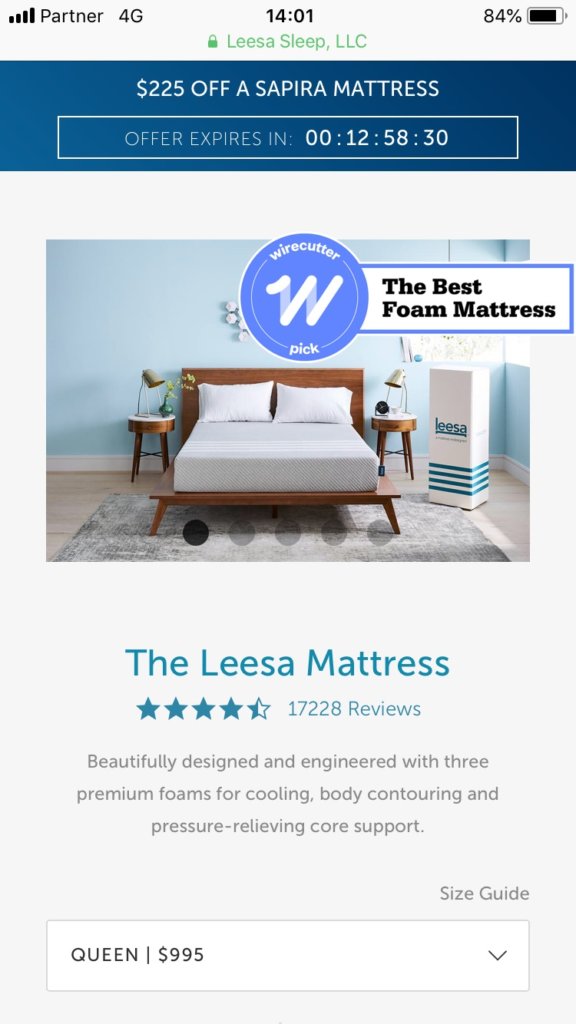
One great example of a brand that effectively builds trust on site is Leesa. They support their products with user-generated content and third-party endorsements throughout the experience. On the above product page, shoppers can feel confident that others have had positive experiences with the brand.
Desktop: The final frontier
While most eCommerce journeys start on mobile, most conversions still happen on a desktop or laptop. Sure, mobile is gaining ground, but we’ve heard it time and time again in usability testing that users feel more confident completing their purchase on a larger screen because of the larger photography, longer product descriptions, and ultimately the ease of filling out forms with a full-sized keyboard (instead of just their thumbs).
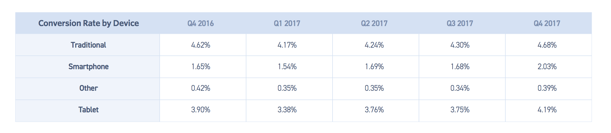 Source: Monetate
By the time the shoppers gets to this point however, they’ve already done their research, experienced your brand on another medium or channel, and they’re ready to buy. While sometimes this touchpoint is just a formality, it still needs to be as fluid and easy as any other interaction.
It’s still very easy to lose shoppers at this last step if the legitimacy and trust that was built throughout their cumulative journey is tarnished by an interaction that leaves them with even a glimmer of doubt.
Be sure to reinforce trust with reservation busters (elements that remove doubt), like a statement about secure payment, easy returns, or quality guarantees. Featuring UGC on checkout pages also helps give shoppers the last bit of social proof they need to push through to purchase.
Conclusion
The new customer journey continues to change retail site design. Device constraints have shifted our focus even more towards progressive disclosure; a limited attention span has made the importance of brand consistency even more prevalent; and user behavior has made the mobile viewport super important in the pre-sale process.
Still, while some things may be in a constant state of change, others remain the same, including these three tips by Jakob Nielsen penned in 2006: Simplify, simplify, simplify.
Diff Agency provides end-to-end, full circle eCommerce solutions for retailers.