


What is an Alt Text?
Have you ever looked at a website and seen a picture, but wondered what it was really about? Or maybe, you’ve been on a slow internet connection, and instead of a photo, you saw a little box with some words inside? Those words are probably alt text! Think of alt text as a secret label for every picture on the internet. It’s super important, not just for making websites friendly for everyone, but also for helping online stores show off their cool products. Let’s dig in and find out why this tiny detail makes such a big difference for everyone browsing the web, from shoppers to search engines.
What Does “Alt Text” Really Mean?
“Alt text” is actually short for “alternative text.” Imagine you have a beautiful picture of a new toy. If someone can’t see that picture – maybe they have trouble with their eyesight, or their internet is acting up – the alt text tells them what the picture shows. It’s like having a helpful narrator describe everything on the screen. This little bit of text lives behind the scenes, tucked away in the website’s code, ready to step in when needed. It ensures that everyone, regardless of how they access information, gets the full picture, so to speak!
Why is Alt Text So Important? The Big Reasons
Alt text might seem like a small detail, but it has a huge impact on how we experience the internet. It plays a critical role in making websites better for everyone and even helps businesses connect with more customers. Let’s explore the main reasons why this simple label is so powerful.
Making the Web Accessible for Everyone
One of the most important jobs of alt text is to make the internet a place where everyone can participate equally. Think about people who are blind or have low vision. They use special tools called “screen readers” to understand what’s on a webpage. When a screen reader comes across an image, it can’t “see” it like we do. Instead, it reads out the alt text aloud.
Without good alt text, an image would just be a mystery box to someone using a screen reader. It would be like trying to understand a story with missing pages! But with clear and helpful alt text, every image becomes understandable. This means everyone gets the same information and can enjoy the website fully. Making your website accessible isn’t just a kind thing to do; it makes your site more valuable and inclusive for a wider audience. It truly helps build a better, more welcoming online world.
Helping Search Engines Understand Your Pictures
Another super important reason for alt text is how it helps search engines, like Google, understand what your pictures are about. You know how you type words into a search bar to find things? Search engines do a similar thing, but they also try to understand images. They can’t “see” a picture like a human can, but they can read its alt text.
When you use good alt text that describes your image clearly, search engines learn what that picture shows. This helps them decide when to show your image in search results. For example, if you have an online store selling a “bright yellow rain jacket” and your image has alt text saying exactly that, someone searching for “yellow rain jacket” is more likely to find your product. This means more people can discover your awesome items! Getting your products seen by more people can lead to higher engagement and a better ecommerce conversion rate, helping your business grow. It’s all part of the big picture of how consumers make their decision-making process.
When Images Don’t Show Up
Have you ever been on a website where a picture just wouldn’t load? Maybe your internet was slow, or there was a technical hiccup. Instead of the picture, you might have seen a small, broken image icon. But sometimes, inside or next to that broken icon, you’ll see a few words. Those words are the alt text!
This is a fantastic backup plan. Even if the picture itself can’t be displayed, the alt text provides a description of what *should* have been there. It prevents a frustrating blank space and gives the user some context. Imagine you’re shopping for a new pair of shoes, and the product image doesn’t load. If the alt text says, “Stylish blue running shoes with white laces,” you still get an idea of what the product is, even if you can’t see it. This small detail can make a big difference in keeping visitors informed and happy, preventing them from just giving up and leaving your site.
How to Write Great Alt Text: A Simple Guide
Writing good alt text isn’t rocket science, but it does require a little thought and care. The goal is to be helpful and descriptive without being overly complicated. Here are some easy tips to make sure your alt text is doing its best work.
Tip 1: Be Descriptive and Specific
When you write alt text, pretend you’re describing the picture to someone over the phone who can’t see it. What are the most important things they need to know? Focus on the main subject, colors, actions, and any text in the image.
For instance, if you have a picture of a cute puppy, don’t just write “dog.” Instead, try “Fluffy golden retriever puppy playing with a red ball on green grass.” This gives a much clearer and more helpful idea of what’s in the image. Be specific about what makes that picture unique or important for your page. The more detail you can provide, without making it too long, the better.
Tip 2: Keep It Concise
While being descriptive is key, you also want to keep your alt text from becoming a long paragraph. Most screen readers will read the alt text aloud, and if it’s too long, it can get annoying or confusing. Aim for a sentence or two, usually under 125 characters, but sometimes a little longer is okay if the image is complex.
Think about the most crucial information. What absolutely *must* someone know about this image if they can’t see it? Try to get straight to the point. If your description starts rambling, it’s a good sign that you might be including too much detail. Focus on clarity and brevity.
Tip 3: Include Keywords Naturally
Remember how alt text helps search engines? This is where keywords come in. If your image is of a product, like a “vintage leather handbag,” make sure those words are in your alt text. But here’s the trick: don’t just list keywords one after another. That’s called “keyword stuffing,” and search engines don’t like it. It also makes your alt text unhelpful for people.
Instead, weave your keywords into a natural, descriptive sentence. So, for that handbag, instead of “handbag, leather, vintage, purse,” write “Close-up of a vintage brown leather handbag with brass buckles.” This way, you’re helping both search engines and people understand the image. Strategic use of keywords can also enhance your ecommerce advertising strategies by making your visuals more discoverable.
Tip 4: Avoid “Image of…” or “Picture of…”
When a screen reader encounters an image, it usually already knows it’s an image. So, starting your alt text with phrases like “Image of…” or “Picture of…” is redundant. It just adds unnecessary words that someone has to listen to or read.
Get straight to the description of the content. Instead of “Picture of a delicious chocolate cake,” simply write “Three-layer chocolate cake with fudge frosting and sprinkles.” It’s more direct, clearer, and makes the experience better for everyone. Every word counts in alt text, so make sure they’re all doing useful work!
Tip 5: Think About Context
The best alt text isn’t just about what’s *in* the picture, but also about *why* the picture is there. What’s its purpose on the page? Is it a product image, a decorative banner, a chart, or part of a user’s review? The context helps you decide what information is most important to convey.
For example, a product image on an online store needs very specific details: “Red cotton t-shirt with a smiling sun graphic, size medium.” A decorative image in a blog post might be simpler: “Abstract watercolor background.” If it’s a chart, describe the data: “Bar graph showing a 20% increase in sales over Q3.” Always ask yourself: “What does this image *do* for this page?”
Tip 6: Don’t Forget Buttons and Links!
Sometimes, images aren’t just there to be looked at; they’re also buttons or links that you can click. For these types of images, your alt text should describe the *action* that happens when you click them, not just what the image looks like.
For example, if you have an image of a shopping cart that, when clicked, takes you to your cart, the alt text should be “Go to shopping cart” or “View my cart.” If it’s an image of an arrow that acts as a “next” button, the alt text should be “Next item” or “Next page.” This is crucial for accessibility, as it tells users with screen readers what will happen if they interact with the image.
Good Alt Text vs. Bad Alt Text: Examples to Learn From
Let’s look at some examples to really understand the difference between alt text that helps and alt text that doesn’t quite hit the mark. Seeing these comparisons can make it much clearer how to write your own effective descriptions.
Here’s a table to help illustrate the point:
| Image Type & Description | Not-So-Good Alt Text | Excellent Alt Text | Why It’s Excellent |
|---|---|---|---|
| Product image: A bright pink water bottle with a straw, sitting on a white background. | bottle |
Bright pink insulated water bottle with a flip-top straw, 32 oz capacity. |
Specific color, function (insulated), key features (straw), and important details (capacity). |
| User-generated content: A customer smiling, holding a coffee mug with a brand logo. | person smiling |
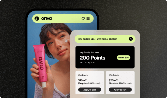
Happy customer Sarah smiling, holding a Yotpo-branded ceramic coffee mug. |
Identifies the person (if known), emotion, object, and relevant brand context. |
| Decorative banner: Abstract blue and green swirls in the background of a webpage section. | blue green pretty swirls |
(empty alt attribute: alt="") |
If purely decorative, an empty alt attribute tells screen readers to skip it, avoiding clutter. |
| Infographic section: A pie chart showing customer satisfaction percentages. | chart of happiness |
Pie chart showing customer satisfaction: 85% very satisfied, 10% satisfied, 5% neutral. |
Clearly describes the type of chart and provides a summary of the key data presented. |
| Call-to-action button: An image of a shopping cart icon that says “Add to Cart.” | shopping cart button |
Add to Cart button. |
Focuses on the action, not just the appearance, making it clear what clicking does. |
As you can see, the excellent alt text provides specific, helpful information that someone who can’t see the image would appreciate. It doesn’t overdo it but gives just enough detail to understand the image’s role and content.
Alt Text in E-commerce: A Superpower for Your Store
For online businesses, alt text isn’t just a good practice; it’s a secret superpower. In the competitive world of e-commerce, every little detail counts, and alt text can significantly impact how shoppers find and interact with your products.
When you sell products online, your images are incredibly important. They’re often the first thing a customer sees and can make or break a sale. Good alt text ensures that your amazing product photos are not only beautiful but also accessible and searchable. This means more potential customers can discover your items through image searches, which is a fantastic way to drive traffic to your store. Think about it: someone searching for “organic cotton baby blanket” might find your product image in Google Images, leading them straight to your store.
Beyond discovery, clear alt text builds trust. When all product images have accurate descriptions, it shows you care about every customer’s experience, including those using screen readers. This level of attention to detail can enhance the overall shopping journey. Furthermore, alt text supports the power of user-generated content (UGC). When customers share photos of your products, or you feature their visual content on your site, adding appropriate alt text to these visual UGC items ensures that even these authentic images are understood by all. Imagine a customer review image showing someone happily using your product; good alt text describes that scene, reinforcing the positive experience for everyone. Yotpo’s Reviews solution helps you collect and display these powerful images, and by making sure they have good alt text, you amplify their reach and impact, reinforcing the power of what is user-generated content.
Alt Text and Customer Loyalty: A Surprising Connection
You might be wondering, how does alt text connect to customer loyalty? It might seem like a stretch, but it’s all about the overall customer experience. When customers have a smooth, easy, and inclusive experience on your website, they’re more likely to return, make more purchases, and even tell their friends about you.
Think about it: a website that is easy for everyone to use, regardless of their abilities, is a sign of a thoughtful and customer-focused brand. When you take the time to add good alt text, you are actively making your site more accessible. This translates into a positive feeling for customers. They feel valued and respected, which in turn builds a stronger connection to your brand. A great ecommerce customer experience is built on many small, thoughtful touches, and alt text is one of them.
When customers feel good about their interactions with your brand, they are more likely to become repeat buyers. This directly impacts customer retention. Brands that prioritize accessibility are often seen as more trustworthy and reputable. This positive perception can strengthen customer relationships and encourage long-term loyalty. Yotpo’s Loyalty program solutions help businesses build these lasting connections by rewarding engagement and making customers feel appreciated. While alt text is a technical detail, its contribution to a seamless and inclusive shopping journey plays a quiet but important role in fostering that essential bond with your customers.
Common Mistakes to Avoid When Writing Alt Text
Even with the best intentions, it’s easy to make a few common mistakes when writing alt text. Knowing what to avoid can help you ensure your alt text is always doing its job effectively.
* Leaving it Empty or Missing: The biggest mistake is not adding any alt text at all! If the alt attribute is completely missing, or if it’s there but empty for an important image (alt=""), it means screen readers and search engines have no idea what the image is about. This leaves a gap in information for many users.
* Keyword Stuffing: As we discussed, don’t just list a bunch of keywords. “Red shoes boots sneakers running athletic comfortable” is bad alt text. It’s unhelpful, looks spammy to search engines, and sounds terrible to a screen reader user.
* Being Too Vague: Just writing “product” or “photo” doesn’t give any real information. Be specific enough to convey the essential content and purpose of the image. “Smiling woman” is better than “person,” but “Smiling woman in a blue dress holding a bouquet of roses” is even better if those details are relevant.
* Being Too Long: While detail is good, excessive length can be just as unhelpful as being too vague. Keep it concise and to the point. A good rule of thumb is to aim for a single, descriptive sentence that captures the essence of the image.
* Duplicating Surrounding Text: If the text right next to your image already perfectly describes it, sometimes you don’t need to repeat that exact text in the alt attribute. This can be redundant and annoying for screen reader users. However, if the image provides *additional* visual information not covered in the text, then alt text is still necessary.
Beyond the Basics: Advanced Alt Text Tips (Still Simple!)
Once you’ve got the hang of writing basic alt text, you might encounter some images that are a bit more complex. Don’t worry, even for these, the principles remain simple.
* Complex Images (Charts, Infographics): For images like graphs, charts, or detailed infographics, a short alt text might not be enough to explain everything. In these cases, your alt text should provide a brief summary of the image’s main point. Then, you might need to provide a more detailed description in the regular text nearby, or link to a separate page that offers a full explanation of the data. For instance, the alt text could be: “Bar chart showing a significant increase in Q2 sales.” And below the image, you would write: “This bar chart illustrates a 30% jump in sales for the second quarter, reaching $50,000, primarily driven by new product launches.”
* Decorative Images: Not every image on a website needs a descriptive alt text. If an image is purely decorative – meaning it doesn’t convey any important information and is just there to look pretty – you should use an empty alt attribute: alt="". This tells screen readers to simply skip over the image, so they don’t bother users with irrelevant details. Examples include tiny border graphics, transparent spacer images, or background patterns. If the image *does* convey meaning, even subtle, it’s never purely decorative.
Putting It All Together: Making Your Website a Better Place
So, what have we learned about alt text? It’s not just a technical detail for web developers. It’s a small but mighty tool that makes the internet more accessible, helps search engines find your content, and provides a crucial backup when images don’t load. By writing clear, concise, and descriptive alt text, you’re not just following best practices; you’re actively creating a better experience for every person who visits your website.
For businesses, especially online stores, mastering alt text is a significant step toward improving your digital presence. It helps more customers discover your products, fosters trust, and contributes to an inclusive customer experience that builds loyalty over time. It’s one piece of a larger puzzle, working alongside powerful tools like Yotpo Reviews for collecting authentic product feedback and Yotpo Loyalty for nurturing customer relationships. Every little detail, from a compelling product image to its carefully crafted alt text, adds up to a successful and welcoming online journey for everyone. Keep practicing, and you’ll be an alt text expert in no time!


 Join a free demo, personalized to fit your needs