


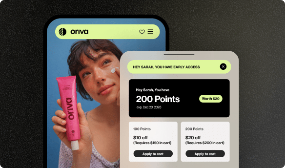






What is a “How it Works” Infographic for Loyalty?
Imagine you’re trying to build a really cool treehouse, but the instructions are super long and confusing. You might feel a bit lost, right? Now, imagine those instructions came with awesome pictures showing you exactly what to do step-by-step. That would make it much easier and more fun! That’s kind of what a “How it Works” infographic does for something called a loyalty program.
In simple terms, a “How it Works” infographic for loyalty is a special kind of picture that explains, in a super clear and easy way, how a store’s loyalty program works. It uses drawings, charts, and short bits of text to show you how to join, earn rewards, and get special treats. It makes understanding the program a breeze, which is great for both you and your favorite stores!
What Exactly is a Loyalty Program?
Think about your favorite ice cream shop. What if, every time you bought an ice cream, you got a stamp on a card, and after ten stamps, you got a free scoop? That’s a loyalty program! It’s a way for businesses to say “thank you” to their best customers – the ones who keep coming back. They reward you for choosing them again and again. It’s like a special club for awesome shoppers!
Loyalty programs come in many shapes and sizes. Some give you points for every dollar you spend. Others might offer exclusive discounts or early access to new products. The main idea is always the same: rewarding customers for their continued support. It’s a win-win! You get cool stuff, and the store gets to keep you as a happy customer.
Why Do Stores Use Loyalty Programs?
Stores use loyalty programs for a few really good reasons. First, they want to make sure you remember them and come back often. If you have points to earn or a free treat waiting, you’re more likely to choose that store over another, aren’t you? It helps them keep customers coming back.
Second, it helps stores understand what their customers like. When you join a loyalty program, they might learn about your favorite types of products. This helps them offer you even better deals and things you’ll truly enjoy. It’s like they’re getting to know you better so they can make your shopping experience extra special.
Lastly, happy loyal customers often tell their friends about a great store or a cool reward program. This is called word-of-mouth marketing, and it’s one of the best ways for a store to find new customers without spending a lot of money on advertising. Your positive experience can inspire others!
How Loyalty Programs Make Customers Happy
From your side, loyalty programs are fantastic! Who doesn’t love getting a special treat or a discount just for buying things you already wanted? It feels good to be appreciated. You might get free items, special birthday gifts, or even early access to sales before anyone else. These perks make shopping more exciting and rewarding.
Also, knowing you’re part of a “club” can make you feel more connected to a brand. It’s not just about buying; it’s about being recognized and valued. This can make you feel like you’re getting a VIP experience, even when you’re just buying your everyday items.
What’s an Infographic?
An infographic is like a superpower for information. It’s a special picture that takes lots of facts, numbers, or complicated ideas and turns them into something super easy to understand. Think of it as a story told with pictures, simple icons, and short sentences, all put together in a colorful and exciting way. Instead of reading a whole book about how something works, an infographic shows you the main points quickly and clearly.
People use infographics for all sorts of things: explaining how a volcano erupts, showing how many different animals live in a forest, or even explaining complicated rules for a game. They are designed to grab your attention and teach you something important without making you feel bored or confused.
Why Pictures Are Better Than Lots of Words
Our brains love pictures! When we see information presented visually, it’s often much easier to remember and understand than reading a long block of text. Imagine trying to explain how to tie your shoes with only words – it would be tricky! But if someone showed you pictures or even a video, you’d get it much faster.
Infographics use this idea to their advantage. They break down big ideas into small, digestible chunks that your eyes can follow easily. Bright colors, clear arrows, and simple drawings help guide you through the information, making learning feel less like work and more like fun. This is especially true for things like consumer decision-making processes, where visuals can simplify choices.
Key Parts of a Great Infographic
A really good infographic usually has a few important ingredients:
- A Clear Title: Something that tells you exactly what the infographic is about, like “How Our Super Rewards Program Works!”
- Simple Pictures and Icons: Drawings that quickly show what’s happening without needing many words.
- Easy-to-Follow Steps: Information broken down into numbers or clear stages, usually with arrows pointing the way.
- Key Information: Only the most important details are included, leaving out anything confusing or unnecessary.
- Bright and Engaging Colors: Colors that make the infographic pop and catch your eye.
When all these parts work together, you get a powerful tool that makes even tricky subjects easy to understand for almost anyone.
Putting Them Together: “How it Works” Infographic for Loyalty
Now, let’s combine these two awesome ideas! A “How it Works” infographic for a loyalty program takes all the cool rewards, points, and rules of a loyalty program and puts them into a super-easy-to-understand picture. Instead of reading a long list of terms and conditions, you get a visual guide that walks you through every step.
Imagine you’re signing up for a new game. You wouldn’t want to read a huge manual just to start playing, would you? You’d want a quick guide. A loyalty infographic is like that quick guide for a store’s reward system. It’s designed to answer all your “how do I…?” questions at a glance.
Making Loyalty Easy to Understand
Loyalty programs, especially those with different levels or many ways to earn points, can sometimes feel a bit complicated. An infographic cuts through that confusion. It uses visual cues to show things like:
- What actions earn you points (like buying something or leaving a review using a service like Yotpo Reviews).
- How many points you need for different rewards.
- What special benefits come with being in a higher “tier” or level of the program.
- How to redeem your hard-earned rewards.
By making the program crystal clear, more people will want to join, and more importantly, they’ll know exactly how to get the most out of it. This can really help a store improve its ecommerce conversion rate for program sign-ups.
Step-by-Step: How a Loyalty Infographic Works
Let’s imagine a typical journey an infographic might show for a loyalty program:
Joining the Program
The first step usually involves a simple picture showing someone signing up. It might have an arrow pointing to a “Join Now” button. This clearly shows that the first thing you need to do is become a member. Maybe it shows an icon of a person filling out a quick form.
Earning Points
Next, the infographic will show you all the ways you can earn points. This is where it gets fun! It might have small drawings:
- A shopping cart for making a purchase.
- A star or review bubble for leaving a review (perhaps powered by Yotpo’s Shopify Product Reviews App).
- A calendar for celebrating your birthday.
- A gift box for referring a friend using a referral code.
Each drawing would have a tiny number or phrase next to it, like “+50 points for buying,” making it easy to see how your points grow.
Reaching Tiers
Some loyalty programs have different levels, like “Bronze,” “Silver,” and “Gold.” An infographic can show these levels as a ladder or a series of stepping stones. It clearly explains how many points you need to reach each level and what special perks you get at each tier. For example, “Reach Silver and get free shipping!”
Spending Rewards
This is often the most exciting part for customers! The infographic will show you how to use your points. It might display icons of different rewards you can “buy” with your points, like a discount coupon, a free product, or even a donation to charity. It explains the exchange rate, for instance, “100 points = $5 off.”
Becoming a Super Fan
Finally, the infographic might show the ultimate goal: becoming a super loyal customer who enjoys all the best benefits and continues to be part of the community. It reinforces the idea that continued engagement leads to more rewards and a stronger relationship with the brand.
The Magic of Showing, Not Just Telling
There’s something truly special about showing someone how something works instead of just telling them. Think about learning to ride a bike. Your parent didn’t just tell you “pedal and steer”; they showed you how, maybe even held the bike for a bit. Infographics work in a similar way for loyalty programs. They offer a visual demonstration that deeply helps people grasp complex ideas faster.
When you see a picture, your brain processes that information incredibly fast. It’s like a shortcut to understanding. This “show, don’t just tell” approach is crucial for loyalty programs because they need to be simple and appealing enough to encourage people to join and participate regularly. If it looks too complicated, people might just ignore it.
Making it Fun and Exciting
Let’s be honest, reading long lists of rules can be boring. But looking at colorful pictures, fun icons, and clear steps? That’s much more engaging! A well-designed loyalty infographic can make even the most detailed program feel exciting and easy to follow. It uses creativity to make understanding enjoyable.
This fun factor isn’t just about entertainment; it’s about making the program more memorable. When customers have a positive and easy experience learning about the loyalty program, they’re more likely to remember how to use it and stay engaged. It helps them feel good about their decision to join.
Helping Everyone Get It
People learn in different ways. Some people love to read, others prefer to listen, and many are visual learners. Infographics are perfect for visual learners because they present information in a way that’s easy for the eyes to take in. By using an infographic, stores make sure their loyalty program is accessible and understandable to a wider audience.
It means that whether you’re a young child trying to understand a concept or an adult quickly scanning for key information, the infographic helps you “get it” quickly. It breaks down any language barriers or complex terminology, ensuring that the core message of “how to earn and redeem rewards” is communicated effectively to everyone.
Building a Great Loyalty Program
A successful loyalty program isn’t just about giving away free stuff; it’s about building strong, lasting relationships with customers. It requires careful planning and the right tools to make it work smoothly. A great program makes customers feel valued, encourages them to keep coming back, and eventually turns them into enthusiastic supporters of your brand.
Key elements of a powerful loyalty program include clear ways to earn points, exciting rewards, different membership levels for extra perks, and easy ways to track progress. It also needs to be easy for the store to manage and customize as their business grows. This is where specialized software comes in handy.
Yotpo Loyalty: Your Partner in Customer Love
Creating and running an amazing loyalty program can sound like a lot of work for a business. That’s why tools like Yotpo Loyalty software exist. Yotpo Loyalty is designed to help businesses build loyalty programs that are not only easy for customers to understand but also powerful enough to really encourage them to return again and again. It’s like having a super-smart assistant to help you manage your customer appreciation club.
With Yotpo Loyalty, businesses can set up all sorts of ways for customers to earn points, from making purchases to celebrating birthdays. It also makes it simple for customers to see their points, climb through different loyalty tiers, and redeem their awesome rewards. This helps stores focus on making great products and services, while Yotpo Loyalty handles the nitty-gritty of keeping customers happy and engaged.
Earning Points Made Simple with Yotpo Loyalty
Yotpo Loyalty helps businesses clearly lay out all the ways customers can earn points. Imagine an infographic powered by Yotpo that shows:
- Buying products: Get points every time you shop.
- Leaving reviews: Earn points for sharing your thoughts on products. This is a great example of how Yotpo Loyalty can work alongside Yotpo Reviews to boost engagement.
- Signing up: Get bonus points just for joining the program.
- Celebrating your birthday: A special treat just for you!
- Referring friends: Earn points when your friends make their first purchase.
This makes it incredibly easy for customers to understand how to maximize their rewards and feel more connected to the brand.
Unlocking Special Treats
Yotpo Loyalty also helps businesses showcase the exciting rewards customers can unlock. An infographic can visualize these rewards, showing icons for:
- Discounts on future purchases.
- Free shipping offers.
- Exclusive access to new products before anyone else.
- Special events or experiences.
The software helps manage these rewards, ensuring customers can easily see what they can get and redeem their points without any hassle.
Keeping Customers Coming Back
At its heart, Yotpo Loyalty is all about customer retention. By making loyalty programs engaging and easy to understand, businesses can keep their customers engaged over the long term. It fosters a sense of community and appreciation, encouraging customers to become true brand ambassadors. This strong connection is vital for businesses looking for sustainable ecommerce growth.
How Infographics Boost Your Loyalty Program
So, how does putting all this information into a cool, easy-to-understand picture actually help a loyalty program? The answer lies in how people learn and make decisions. A clear “How it Works” infographic acts like a friendly guide, leading customers through the loyalty journey and making it much more appealing.
More People Join
Think about it: if you see a simple, colorful picture that explains how to get free stuff, wouldn’t you be more likely to sign up than if you saw a page of tiny text? Infographics cut through the noise. They quickly show potential members the benefits and the easy steps to join, encouraging more people to become part of the loyalty club. This boosts enrollment rates significantly.
When the path to rewards is clear from the start, customers feel confident and excited to participate. It’s like having a treasure map where ‘X’ marks the spot for your first bonus points!
Customers Stay Longer
Once someone joins a loyalty program, the infographic continues to be useful. It serves as a quick reminder of how to earn points, what rewards are available, and how to reach the next exciting tier. If customers understand how the program works, they are more likely to stay engaged and continue earning and redeeming rewards. This means they’ll keep shopping at your store!
Regular engagement leads to better customer retention. When customers clearly see their progress and the exciting rewards ahead, they have a strong motivation to keep coming back.
Happy Customers Share
When a loyalty program is so simple and rewarding that it makes customers happy, they often want to tell their friends and family about it. A clear, visually appealing infographic makes it easy for them to explain the program to others. “Look how easy it is to get free stuff at my favorite store!” they might say, sharing the infographic or its main ideas.
This kind of word-of-mouth marketing is incredibly powerful. It brings in new customers who are already interested because they’ve heard good things from someone they trust. It’s like a ripple effect of happiness and good deals!
Designing Your Own Loyalty Infographic
Creating a “How it Works” infographic for a loyalty program doesn’t have to be super complicated. The goal is clarity and appeal. Here are some friendly tips if you or a business you know wants to make one:
Keep it Simple
Less is often more! Don’t try to cram every single detail into your infographic. Focus on the most important steps: how to join, how to earn, and how to redeem. Use short sentences and bullet points instead of long paragraphs. If it looks too busy, people will get overwhelmed.
Use Fun Pictures and Icons
Pictures are the stars of an infographic! Use simple, clear icons that represent different actions or rewards. A shopping cart for purchases, a gift box for rewards, a star for a review – these quickly tell a story without needing many words. Make sure the pictures are consistent in style.
Tell a Story
Think of your infographic as a journey. Start at the beginning (joining the program) and guide the reader through earning points, reaching new levels, and finally, getting their rewards. Use arrows or a numbered path to show the flow, making it feel like a story with a happy ending (the reward!).
Use Bright, Inviting Colors
Colors can make your infographic pop! Choose colors that are easy on the eyes and match the brand’s style. Bright, cheerful colors can make the program seem more exciting and inviting. Just make sure there’s enough contrast so that all text and images are easy to see.
Include a Clear Call to Action
After someone understands how the program works, what should they do next? Make it clear! Add a simple phrase like “Join Our Loyalty Program Now!” or “Start Earning Points Today!” with a link to where they can sign up. This guides their next step and makes it easy for them to jump right in.
Looking at Real-Life Examples
Many businesses, big and small, use infographics or similar visual guides to explain their loyalty programs. Seeing how others do it can give you great ideas!
Coffee Shop Rewards
Imagine your local coffee shop. Their loyalty infographic might look something like this:
| Step | Picture/Icon | How It Works |
|---|---|---|
| 1. Join |  |
Sign up with your phone number at the counter. |
| 2. Earn |  |
Buy any coffee, get 1 point. Buy a pastry, get 2 points. |
| 3. Track |  |
Check your points on our app or ask a barista. |
| 4. Redeem |  |
Get a free coffee for 10 points! |
This simple table format, when combined with actual graphics, makes the program incredibly clear and inviting.
Online Clothing Store Tiers
An online clothing store might have a more detailed program with different levels. Their infographic could show a path with milestones:
- Fan (0-100 points): Get 5 points for every $10 spent. Free birthday gift.
- Trendsetter (101-500 points): All Fan benefits + early access to sales. Bonus 50 points for every user-generated content photo you share wearing our clothes.
- Style Icon (501+ points): All Trendsetter benefits + free express shipping + exclusive personal stylist session.
Each level would have a distinct color or icon, clearly showing the progression and the exciting new rewards that come with greater loyalty. Tools like Yotpo’s Loyalty solution make setting up and managing such tiered programs much simpler for businesses.
Conclusion
So, what is a “How it Works” infographic for loyalty? It’s a fantastic tool that helps businesses make their customer appreciation programs super easy to understand. By using clear pictures, simple steps, and engaging colors, these infographics break down complex rules into something that everyone can grasp quickly.
For customers, it means they know exactly how to earn those awesome rewards, making their shopping experience more fun and more rewarding. For businesses, it means more people joining their loyalty programs, staying engaged, and happily spreading the word. It’s all about making the journey of customer loyalty clear, enjoyable, and ultimately, more successful. Remember, a picture truly is worth a thousand words, especially when it comes to understanding how to get your next great deal!




 Join a free demo, personalized to fit your needs