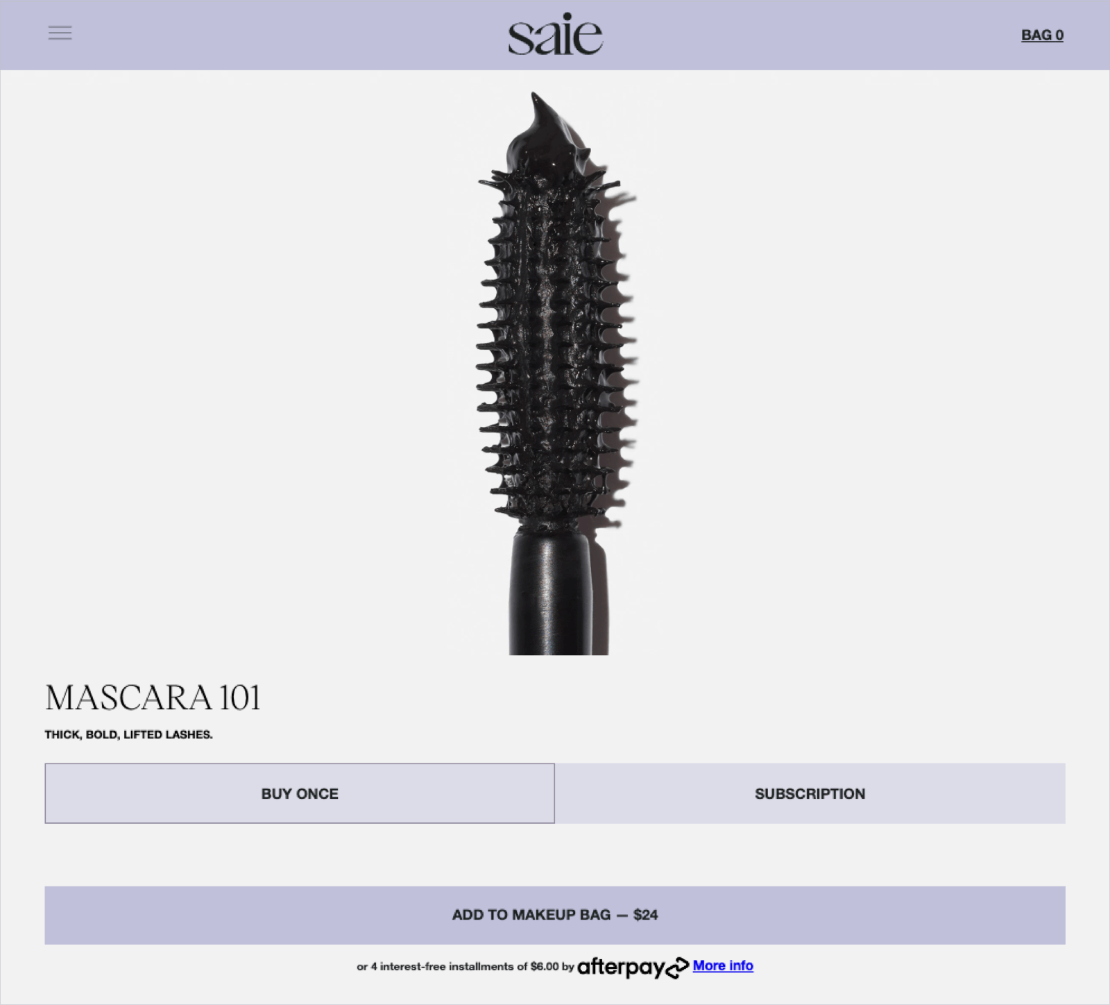
Category: Beauty
Saie is an NYC-based clean make-up brand that sells products that are free from toxic chemicals, but also work and look good. Their product pages are slick, effective, and built for conversion.
Why it works:
- Eye-catching, detailed visuals: This page, for Mascara 101, features a large, zoomed-in product image plus several more below as well as videos that demonstrate application.
- Subscription options: There are two options for purchase: buy once or subscribe, which makes it easy for repeat buyers to automate that process.
- Product upsells: There are two areas for product upsells: a lash curler, right below the call-to-action, and a “plays well with” module below, listing complementary products.
- Consumer education: The product page has a section about harmful ingredients often found in mascara. This is unique and effective because as a clean beauty brand, it highlights their commitment to avoiding harsh chemicals in their products. It also serves as an educational tool for consumers, helping to establish brand trust.
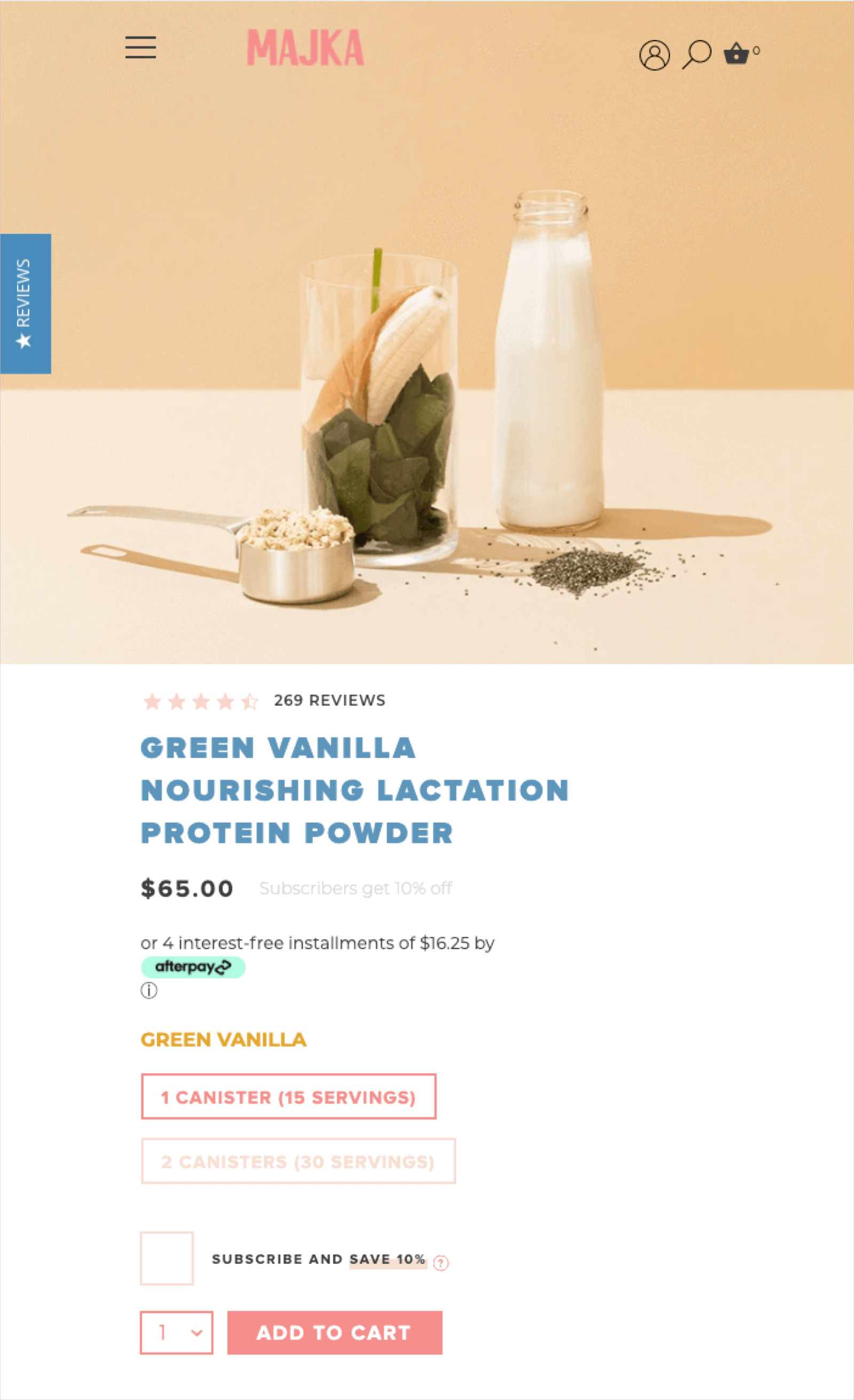
Category: Health & Wellness
Mom-focused nutrition company Majka offers premium products that are natural, safe, and good for both mothers and babies. Their product pages offer tons of useful information along with an eye-catching design.
Why it works:
- Free shipping minimums: Majka lets customers know the free shipping minimum right below the CTA, which means fewer surprises for customers as they navigate to purchase.
- Click to contact: If you have questions about the product, company, or shipping, you can click to send a message right from the product page.
- Installment options: For customers who don’t want to pay full price up front or don’t have access to a credit card, Majka offers installment options with Afterpay.
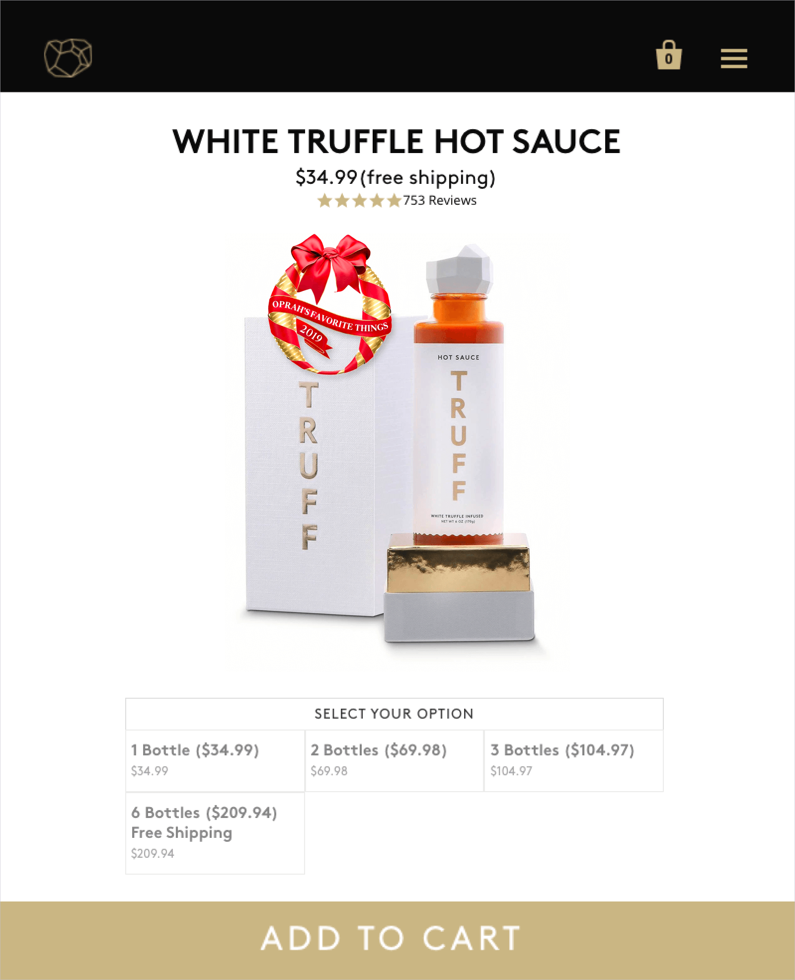
Category: Food
Hot sauce brand Truff sells truffle-infused condiments and takes a minimalist, yet functional, approach to their product pages.
Why it works:
- Effective copy: The brief description above the fold tells you exactly what the product is and what’s in it.
- Product upsells: Truff offers pricing for sets of multiple bottles, encouraging customers to purchase more than one. The “free shipping” is prominent for each option when you click on it, so customers know what they’re paying up front.
- Frequently asked questions: Each product page features an FAQ, which answers common questions like, “How hot is it?” and “How long does shipping normally take?”
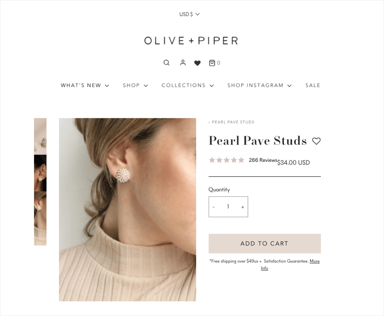
Category: Jewelry
Fashion jewelry boutique Olive + Piper sells classic and trendy pieces for everyday wear or for special occasions, like weddings. Their pages are smartly laid out and designed for maximum conversion.
Why it works:
- Well-designed product information: The clickable tabs for description, details, and shipping and returns allow the brand to get more important information about the product above the fold.
- Visual UGC: Below the fold, the “Styled on Instagram” widget shows real customers wearing the product, giving customers a sense of how they might look on someone similar to them. They also have user-uploaded customer photos incorporated in the reviews section, offering even more visual social proof.
Category: Health & Wellness
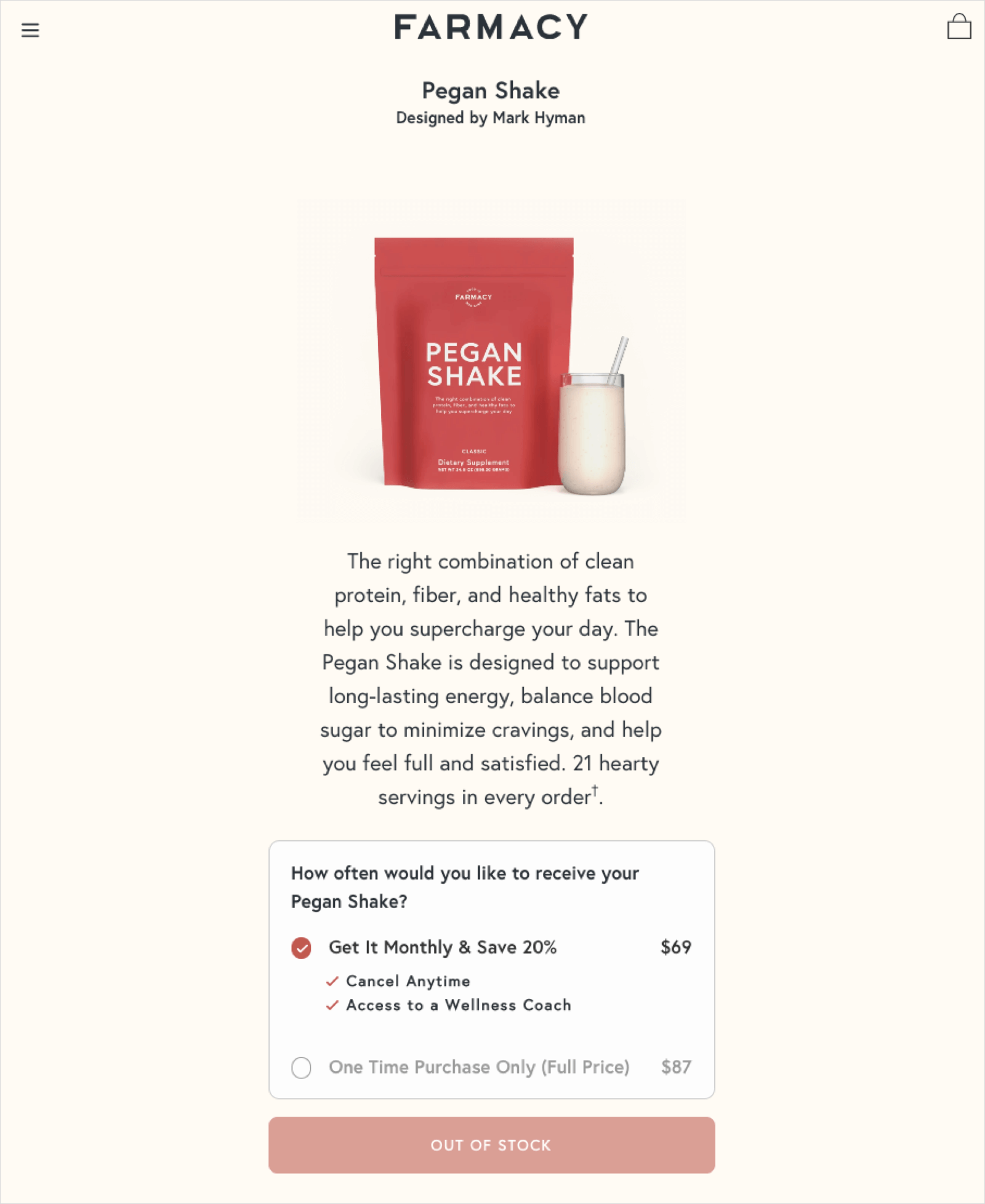
Dr. Mark Hyman’s wellness brand Farmacy promotes the “pegan diet,” a combination of paleo and vegan. The product page for the Pegan Shake has some interesting attributes to help boost FOMO and interest.
Why it works:
- Subscription options: Instead of the typical “subscribe and save” messaging, it asks, “How often would you like to receive your Pegan Shake?” This makes the customer feel as if they are getting a more personalized experience.
- Out of stock messaging: At the time of writing, the Pegan Shake was sold out, so there’s an “out of stock” message, and an email sign up for notification when it’s back in stock. The ratings and reviews, which are plentiful and positive, are highlighted right below the out of stock message, giving customers a feeling of FOMO and making them want the product more.
Category: Food
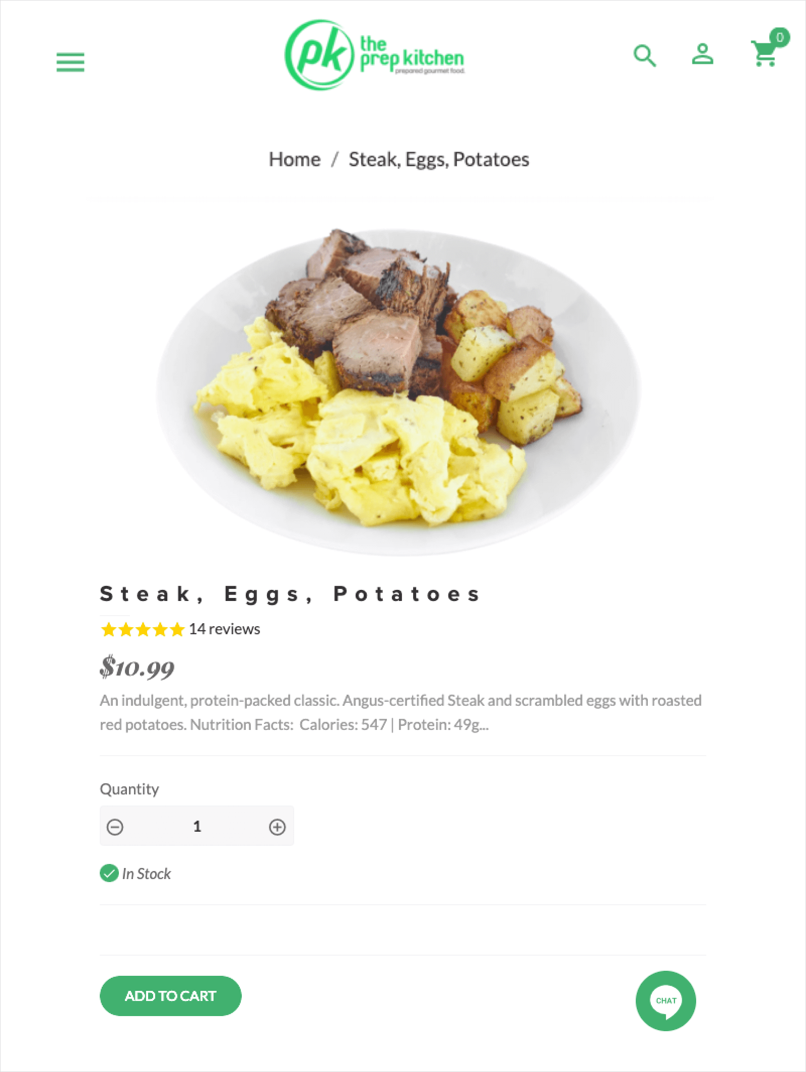
Dallas meal-prep service The Prep Kitchen offers prepared food to make meal planning more simple. Their product pages are simple, too, and quite effective.
Why it works:
- Product upsells: In addition to the delicious looking main product photo, you’ll find a widget with thumbnails of other mouthwatering dishes to try. Hungry customers will have a hard time resisting the photography.
- Link to information about the service: Every product page contains a link to the “How it Works” page, which gives information on ordering and pick up, as well as the meals. That way, no matter where a customer lands on the site, they have a quick way to get the information they need.
Category: Clothing
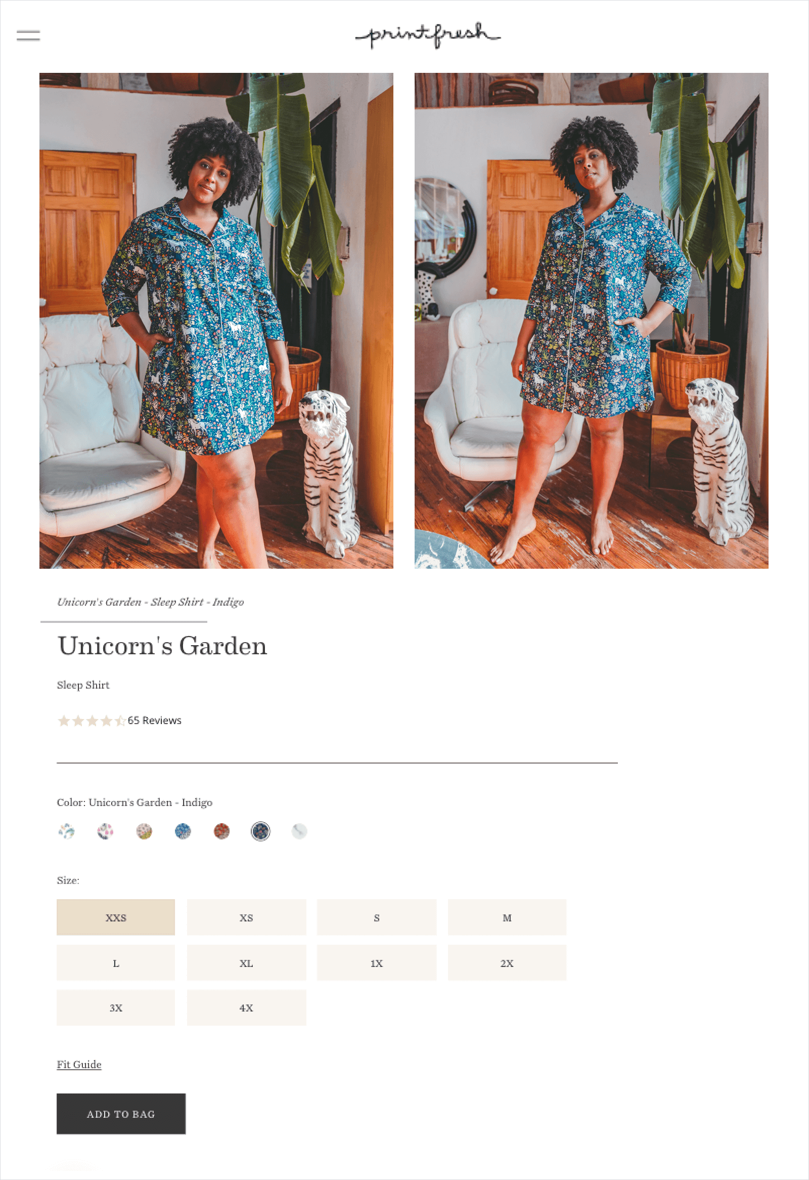
Printfresh sells hand-crafted, luxury sleepwear featuring bold colors and prints. The brand’s product pages are all about helping customers find their perfect items.
Why it works:
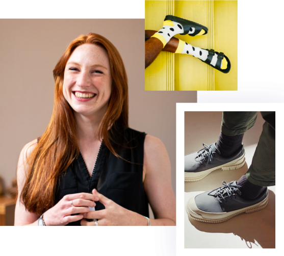
- Fit help: To better assist with fit, Printfresh does two things: one, they feature models with different body types wearing the product variations, and two, they have a fit guide, which gives you more information about sizing.
- Chatbots: There are chatbots embedded in the product pages to help customers by answering questions or directing them to other products.
- Review filters: Filters on the reviews section allows customers to see what other buyers had to say about product quality, size, or other attributes.
Category: Skincare
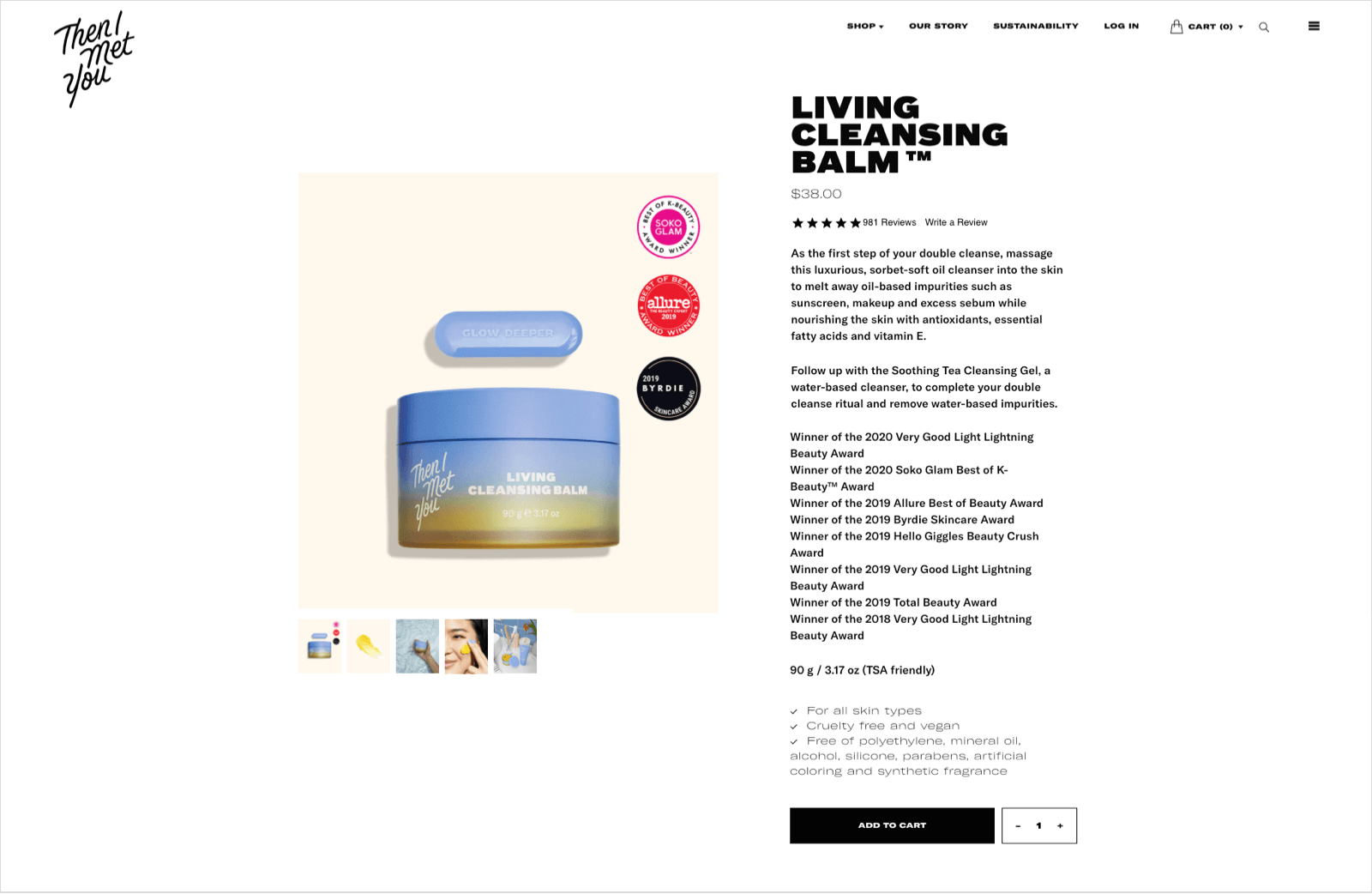
K-Beauty brand Then I Met You sells premium, cult-favorite skincare products. Their stunning product pages are designed to showcase quality and effectiveness.
Why it works:
- Awards and badges: Right under the product description is a lengthy list of awards the product has won, and the badges to the right of the product reinforce the idea that these products are well-loved across the industry.
- Product demo: Below the fold, a video shows consumers how to use the product, along with a complimentary product. This serves as both customer education and an upsell opportunity.
- Helpful reviews: The reviews are informative for shoppers, because each one has the reviewer’s age range and skin type. This makes it easy for a consumer to know if a product is likely to work with their skin.
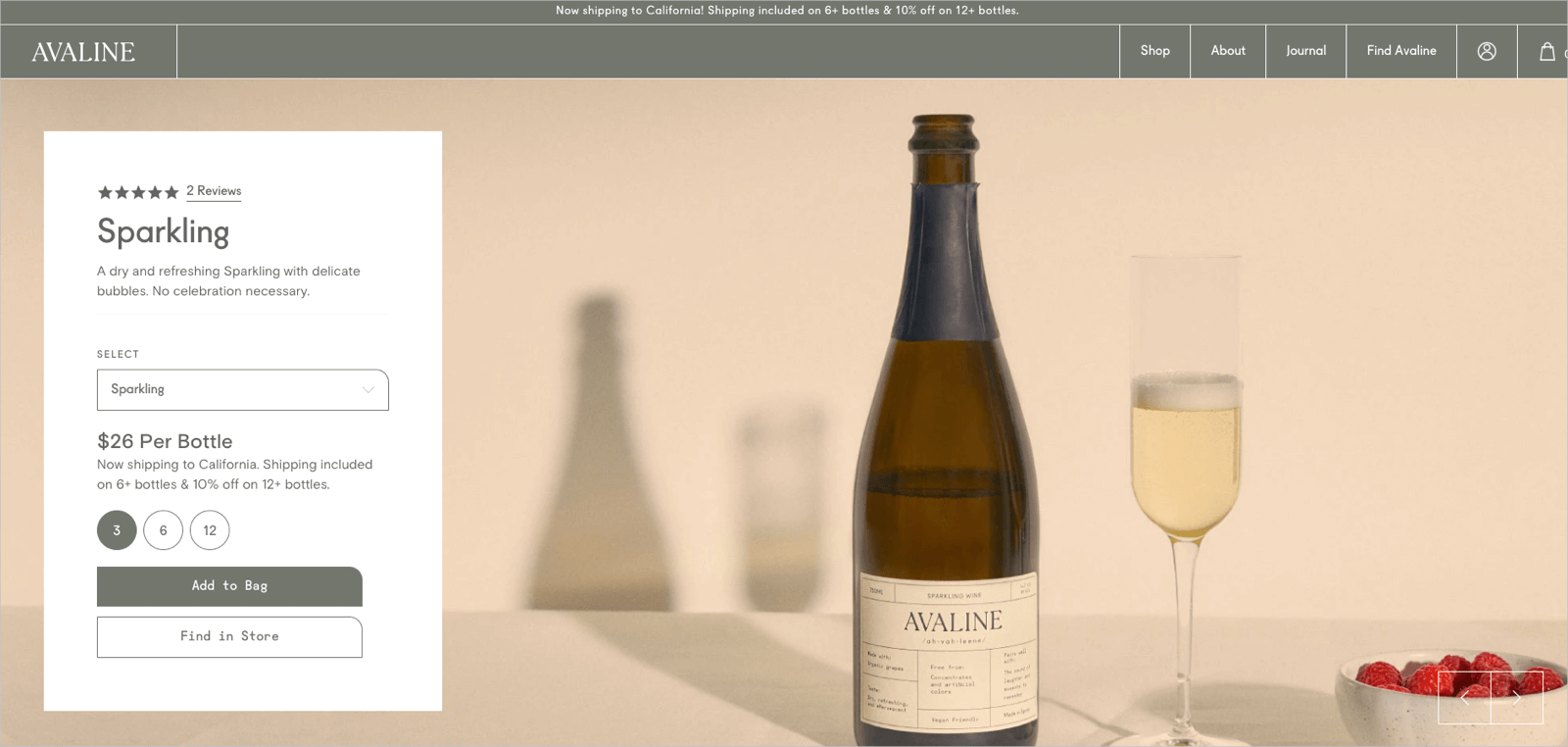
Category: Beverage
Clean wine brand Avaline isn’t selling direct-to-consumer yet, but they’ve already built out full, gorgeous product pages for each item they sell.
Why it works:
- Get notified: On each page, you can sign up to be notified when you can buy online. This is a smart strategy because when they’re ready to start selling online, they’ll already have a database full of interested customers ready to add wine to their carts.
- Find it in-store: Consumers can input their ZIP code to find a retailer near them where they can purchase in-store.
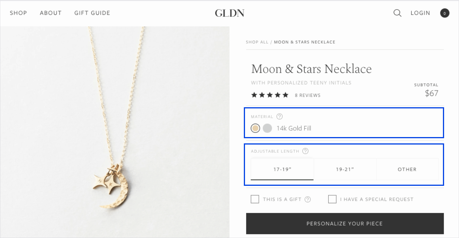
Category: Jewelry
Personalized jewelry brand GLDN has product pages that are all about ensuring customers buy the perfect piece.
- Customization: Above the fold, shoppers can select their preferred material, length, and personalization options. They can even make special requests or open the live chat with questions. Below the fold are detailed photos, and tons of information to help consumers choose the right options.
- Visual size guide: The visual size guide shows you how the necklace will fall on different body types.
- Visual UGC: At the bottom, a GLDN IRL section shows you how the pieces look on real people.
These 10 eCommerce stores employ the product page fundamentals we highlighted in this guide to great effect. They also utilize many of the techniques that you’ll find in the chapters to come, such as visual UGC, installment options, cross-sells and upsells, and much more.


 Join a free demo, personalized to fit your needs