


Creating the Perfect Product Page: An Intro to the Essential Elements
How do you plan your product page layout? What are your must-have elements? In this chapter, you will learn the basics of creating your first product page.
Thank You!
 Product Page Guide
How do you plan your product page layout? What are your must-have elements? In this chapter, you will learn the basics of creating your first product page.

PageFly is the Shopify Advanced Page Builder and Conversion Rate Optimization App, making eCommerce effortless and CRO hands-free for 70,000 merchants.


This guide explores everything you need to know to create attractive, functional product pages (eCommerce PDP) that convert — including optimizing for the mobile shopping experience, creating professional product visuals, the benefits of chatbots, an overview of flexible payments, and more.
In this first chapter, we’ll discuss the basics of building product pages that convert, including how to plan your product pages, must-have elements, nice-to-have elements, and some examples of brands who are doing it right.
Your product pages are what is going to make the difference between a bounce and a conversion. And most brands don’t pay nearly enough attention to them.
It’s great to have a beautiful, functional homepage for your eCommerce site, but is that the page most visitors will land on? Probably not. Chances are, they’re searching for a specific item, like “red v-neck dress” or “men’s waterproof watches,” and land directly on your product page.
Brands spend a lot of time and money to get consumers to their product pages, and while a low conversion rate can sometimes signal a not-so-great product, most of the time, it’s because the page didn’t have the necessary information that a customer needs to be persuaded to make a purchase.
Your product pages need to do three things:

If it sounds like a tall order for one page, it is. But with some planning and a little work, you can create quality customer experiences that lead to sales.
Before you even think about design or development, you need to have a plan, and that starts by mapping out all of the elements you want to put on your product page. Each element should serve a purpose, provide a specific piece of needed information, and play a role in moving visitors deeper into the buyer’s journey.
No matter what your industry, these are the items that need to be on your product pages, along with some best practices for implementing them.
Your product page goal is to get a customer to add the product to their cart. That’s where a strong call-to-action comes in. Make sure the button is placed prominently on the top half of the page, that the color stands out, and that the messaging is clear about the next step. Strong CTAs typically begin with an action, like “order”, “buy”, or “get,” and they are brief; many eCommerce stores opt for CTAs with only two or three words.
While traditionally stores use actions like “Buy Now” or “Add to Cart,” at PageFly, we have found that CTAs with personalization or language that’s more natural to the user can be more powerful. The key though is to experiment and test to find the best iteration for your brand.
Your customers can’t hold, touch, or try on your product, so the only way you can interact with their senses is through photos and virtual experiences.
Later in the guide, we’ll dive deeper into the nitty-gritty about product photos, including advanced options like augmented reality (which Shopify listed as a key trend in 2021). But at minimum, consumers should be able to zoom in on product details, and you should include different views that will help sell your product. For example, a customer shopping with a food brand might want a view of the nutritional information on the back of the box.
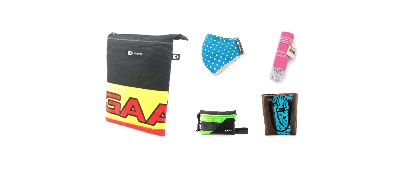
KitePride is an example of a brand that does product photos well, offering close-up detailed views of the product as well as lifestyle photos, so customers can envision how it will look when they use it in real life.
Is your product available in different colors, sizes, or flavors? Make sure that customers can see what each option looks like, if applicable. For example, if you sell a sweater in blue, consumers will want to be able to see the sweater in that shade — in all the same variations — so they can decide whether or not they like it.
Product descriptions are so important, and many brands don’t make the most of them. This is where you get in all the product keywords, and tout the great things about your product. Is it U.S.-made? Is it sustainable? It is wrinkle-proof and dryer-friendly? These are all things that can help you sell your product to your target customer.
If your shipping and refund policy is further along in your checkout process, you risk cart abandonment. Stating your policies up front lets consumers make an informed decision, and they won’t have any unpleasant surprises at checkout.
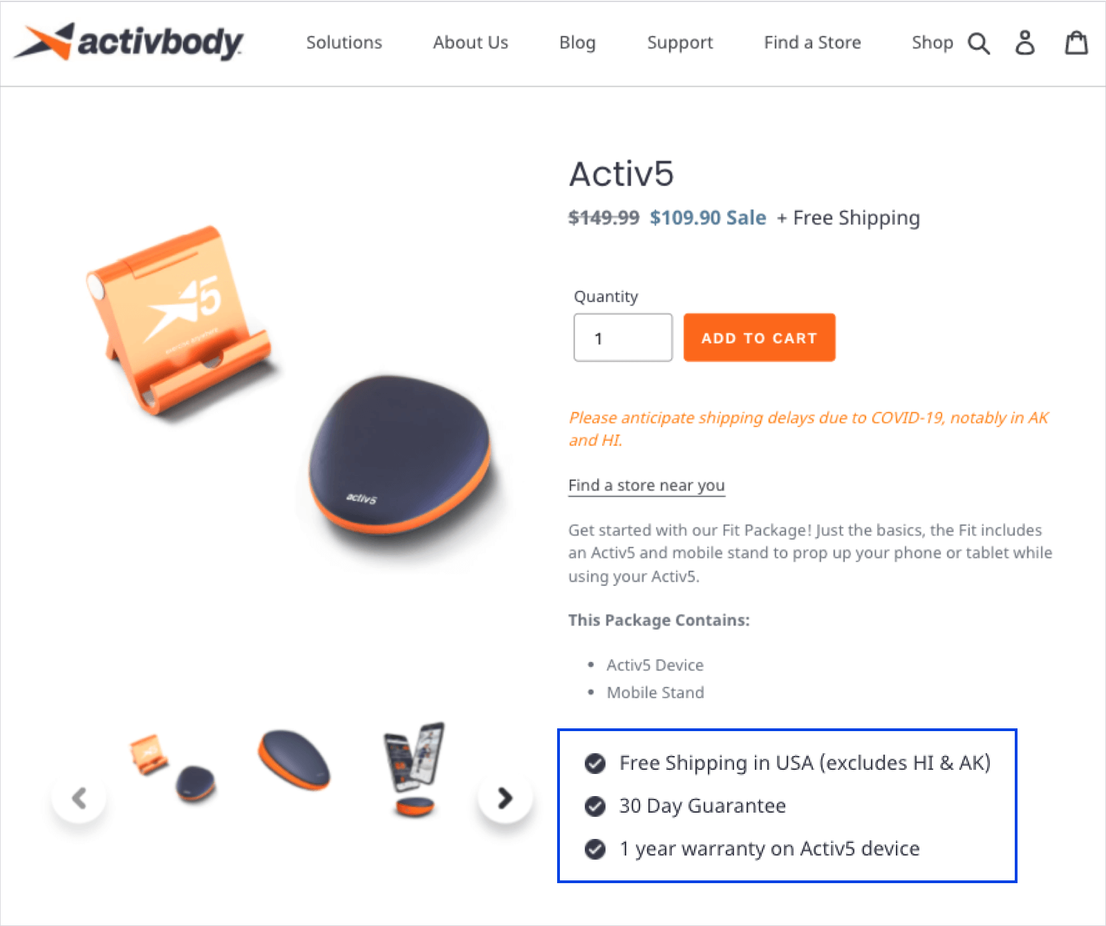
For example, Activbody places vital shipping information on their product pages above the fold. It clearly states that customers get free shipping, and also that you might experience shipping delays if you order it due to COVID-19. There’s also a link to find it at other eCommerce sites or in a brick-and-mortar store, while below the fold, you’ll find an overview of product highlights and benefits, reviews, and testimonials to build brand trust.
Displaying customer ratings and reviews will help to boost conversion and build brand trust, which we’ll dive deeper into later in this guide. If you can incorporate visual user-generated content like photos and videos of customers engaging with your products, even better.
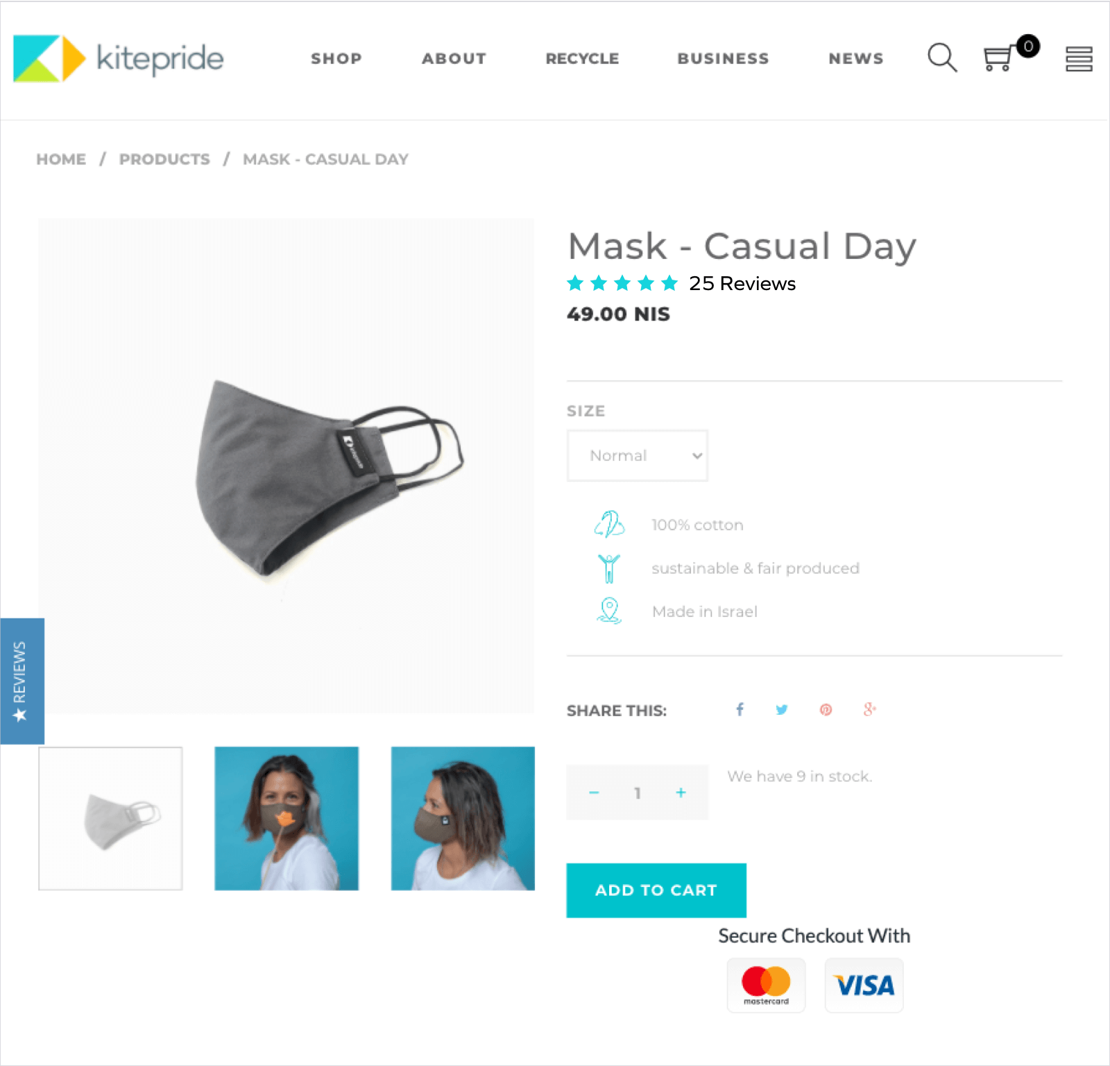
As you can see in the below example from KitePride, the 4+ star rating and a link to reviews for the product is right underneath the product name, so customers will immediately see that this mask is a popular, top-rated product.
Mobile eCommerce, or M-commerce, continues to grow. In fact, it’s expected to grow 68% by 2022. And consumers expect mobile experiences that rival those on desktop. If your site doesn’t deliver, you’re likely to lose a customer.
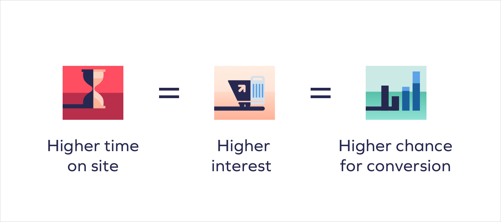
By having proper breadcrumb navigation, you help visitors have a better understanding of product hierarchy and avoid a broken user experience by allowing your visitors to navigate easily to other areas of interest — which eventually increases time on site and reduces bounce rates. After all, higher time on site = higher interest = higher chance for conversion.
These are just the basics for product pages. We’ll be exploring the bells and whistles that you need to really set your product pages apart — like chatbots, 360 degree and 3D photos, split payments, and more — in later chapters of this guide.
When considering the layout of your page, it’s essential that the most important elements be above the fold — or on mobile, on one screen. Here’s what you should place as high on the page as possible:
Your shipping and refund information can go below the fold. Customer reviews can also go in this area, but it’s a good idea to incorporate aggregated star ratings near the top so consumers will immediately know whether or not your product is popular.
Now that you know the basics of product page fundamentals, it’s time to take your product pages to the next level. Read the next chapter to learn how to make your pages mobile-first, and later you’ll get advanced strategies about everything from truly bringing your products to life to building consumer trust. This guide will help you to create product pages that convert, help you to build a loyal customer base, grow your store’s traffic, and — most importantly — increase your revenue.
“Yotpo is a fundamental part of our recommended tech stack.”
 Laura Doonin, Commercial Director


 Join a free demo, personalized to fit your needs