


The Mobile Product Page Experience
Brands don’t need a mobile-friendly site, but a mobile-first one. Leverage touchscreen gestures, add more product options, and prioritize visuals to create an unmatched mobile experience.
Thank You!
 Product Page Guide
Brands don’t need a mobile-friendly site, but a mobile-first one. Leverage touchscreen gestures, add more product options, and prioritize visuals to create an unmatched mobile experience.
Tapcart is a Shopify Plus Certified app partner and all-in-one solution for 20,000+ eCommerce brands to design and launch a mobile app.


With 72% of eCommerce revenue coming from mobile shoppers, the current struggle for many brands today is that mobile websites host the majority of online traffic and yet see low conversion rates. Having a mobile responsive website isn’t good enough these days; brands need a site designed for mobile first.
In this chapter, we’ll discuss mobile shopping trends, and how to create high-converting mobile product pages that provide your customers with a seamless m-commerce experience.
The COVID-19 pandemic accelerated two trends that were already years in the making — a shift from brick-and-mortar shopping to eCommerce, and from eCommerce to m-Commerce. As more and more consumers buy groceries, essentials, wellness items, and more from their mobile devices, brands will need to adapt to provide them with a frictionless retail experience.
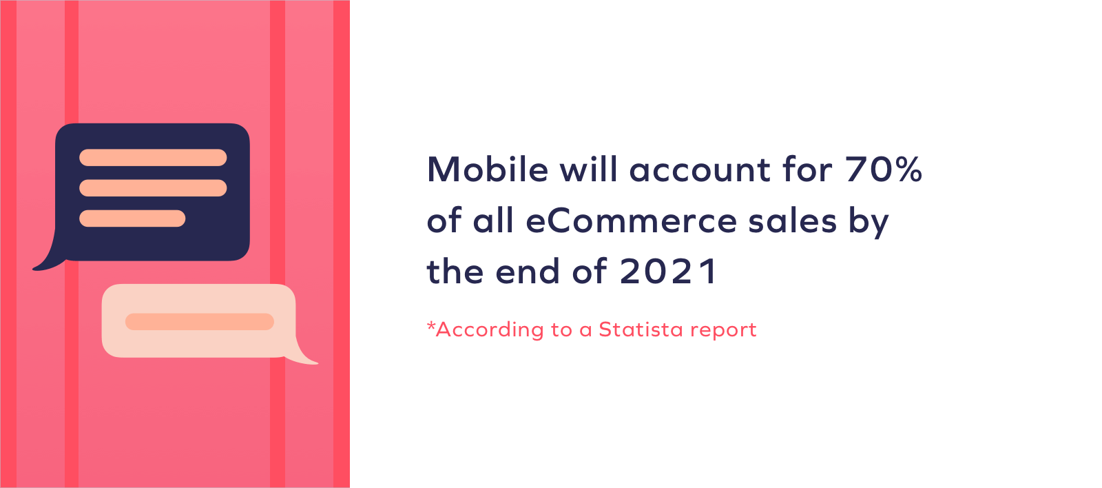
According to a report from Statista, m-commerce is predicted to account for more than 70% of all eCommerce sales by the end of 2021. Is your brand ready?
Here are five important mobile shopping trends to watch out for in the next year… and beyond.
The more options you can give consumers for payments, the more likely they are to convert. Companies like Sezzle or Klarna offer payment alternatives for those who either don’t have or don’t want to use credit cards, like paying in installments. Expect to see more ways to pay pop up as time goes on to meet customers’ desires for a more personalized shopping experience.
The more brands can meet consumers where they are, the better able they’d be to convert them to customers. We saw this during COVID-19, when brick-and-mortar stores scrambled to get their inventories online, or offer in-store and curbside pick-up.
Whether your store lives on a website, an app, or downtown on Main Street, offering touchpoints that give consumers a choice or where and how to shop increases the likelihood that they’ll make a purchase.
Brands are increasingly bringing a QVC-live commerce experience to smartphones via platforms like Instagram Live Shopping and through native apps. And there’s a good reason for that: nearly three quarters of shoppers are more likely to make a purchase after watching a product video. Video is a proven tool for engagement and conversion, so it’s only natural that brands would want to integrate it into the shopping experience.
Product recommendations are a ubiquitous part of the eCommerce experience, and the brands that see the best conversions are the ones with the smartest algorithms. AI-powered recommendations allow you to create deeper relationships with customers, because as they collect more data points throughout the customer journey, they serve better and better recommendations.
As a mobile app provider that powers over 7,000 Shopify stores, we have long believed that apps are the future of m-commerce, and brands are catching on. In fact, our brands see 3x more conversions on mobile apps than mobile websites. Why?
M-commerce is exploding right now due to COVID-19, but it will remain long after the pandemic ends. Brands that provide shoppers with a unique, flexible, engaging, and smart mobile shopping experience will be poised to acquire new shoppers during this time, and turn them into loyal customers and brand advocates in the long-term.
Your product pages are the most important pages in your mobile shopping experience. That’s where conversion happens — or, if your pages aren’t optimized for mobile, where conversion doesn’t happen.
Whether your product pages live on your website, on your mobile shopping app, or on both, your product pages need to be designed to convert. And that looks different on a smartphone than it does on desktop, so it’s important to understand the distinction.
These five best practices will help you to design high-converting product pages, so you can provide your customers with a frictionless, enjoyable m-commerce experience.
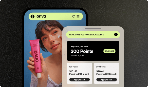
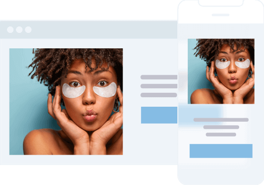
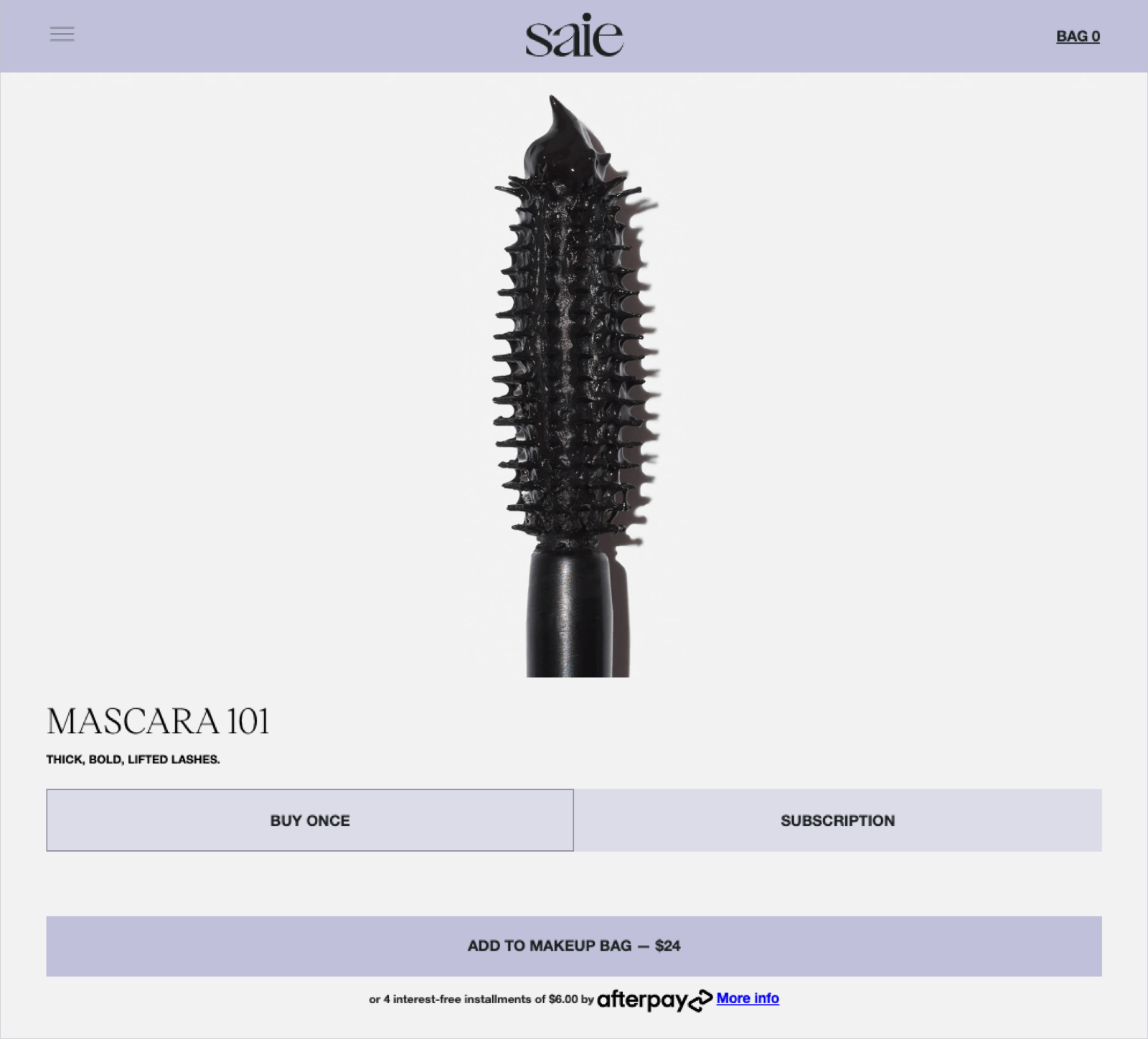
Before customers buy your product, or even learn more, they need to see the product. Your product visuals can be video, static images, gifs, or a combination of all three, but they need to be the first thing a customer sees when they land on your product page.
No matter what type of visuals you need, they need to be of the highest quality. You want to ensure that if a customer decides to zoom in on an aspect of your product on their smartphone, that what they see makes them want to buy.
Consumers are used to navigating on their devices with mobile gestures, which include tapping, swiping, and pinching. The more you can incorporate these into your design, the more mobile-friendly your product pages will be.
Allow customers to swipe through product images, tap to see product options, or pinch to zoom in on product details.
You might have some customers want to read your detailed product description and don’t mind scrolling down to get all of the necessary information before they decide to purchase your product. But what about the customers who already know they want to buy it? They definitely don’t want to have to scroll, so that’s why you need a prominent buy or add-to-cart button above the fold.
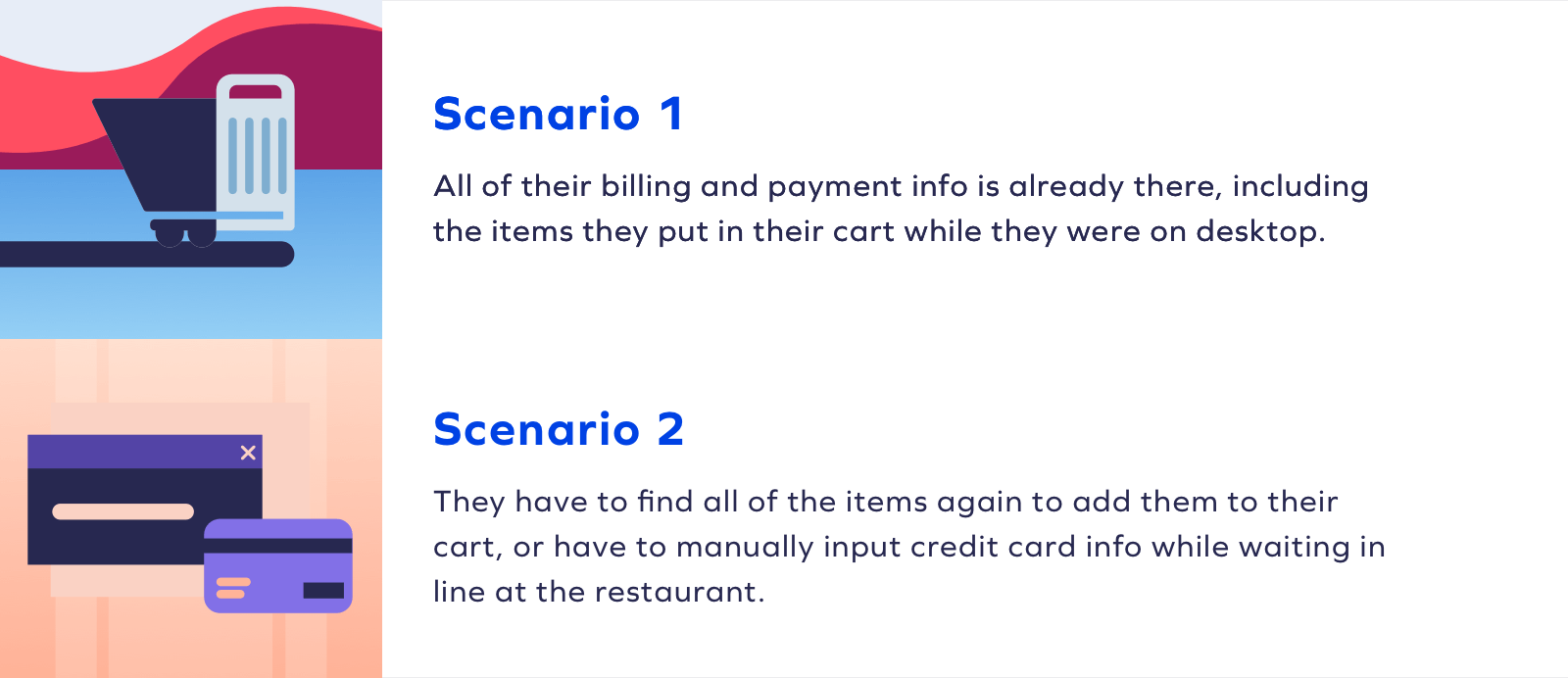
Let’s say a customer is shopping at your online store on desktop and adds a few products to their cart. Then they get an important phone call and have to leave the house right afterward to pick up a takeout order. While they’re waiting in line to get their food, they get a cart abandonment text and go to your store to complete their order.
Scenario 1: All of their billing and payment info is already there, including the items they put in their cart while they were on desktop.
Scenario 2: They have to find all of the items again to add them to their cart, or have to manually input credit card info while waiting in line at the restaurant.
Which scenario is most likely to result in a sale? Remember that customers use more than one device to shop. The more data you can store on their customer journey, the more likely you are to keep them on the path to purchase.
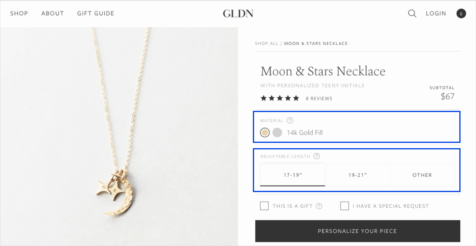
When designing mobile product pages, how you utilize your available real estate is incredibly important, especially if you offer products in a variety of colors, sizes, flavors, or other options. The more visually you can display the options, the less real estate you’ll have to use, and the more information you’ll be able to get on a single page.
For example, if you offer a product in several colors, displaying them side by side as icons and allowing a customer to see them with a tap is much more seamless than them having to select an item from a dropdown or list to see it. Visual icons also allow a customer to make a decision faster than text, because they can actually see it.
Product pages are the place to captivate your customers and get them to checkout, and that requires strategic UI and on-brand design. At Tapcart, we’re building a Product Page Designer to make the mobile experience even more customizable and flexible on an app.
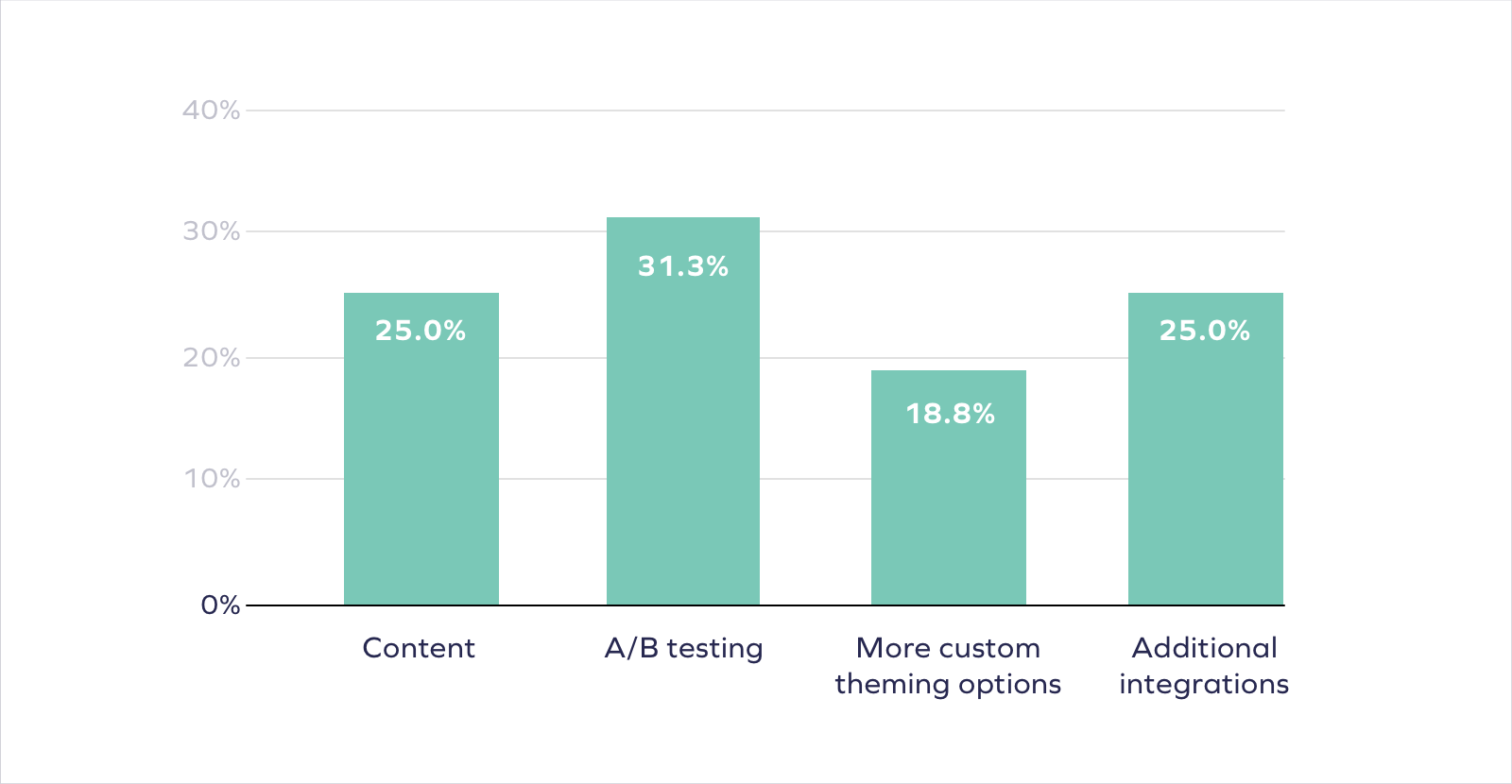
To build this new feature, we asked eCommerce merchants: if you had the ability to redesign your mobile app’s product display page, what factor would be the most important? Here was the consensus:
25.0%: Content (e.g. custom banner, video, etc.)
31.3%: A/B testing to optimize conversion rate
18.8%: More custom theming options
25.0%: Additional integrations
With this feedback, we wanted to create the perfect mobile product page from the UI to UX. Now, you can add content and rearrange your page hierarchy to tell your story, your way. From custom content like size guides and product videos, to offering integrations (FourSixty UGC, additional Nosto product recommendations), the mobile experience will reflect the desktop.
Mobile shopping experiences are different than those on desktop. If you want to convert mobile users to customers, having a responsive design for your product pages isn’t enough. Your product pages are going to make or break your sales, so it’s worth putting some energy isn’t making sure they’re not just mobile-friendly, but mobile-first.
“Yotpo is a fundamental part of our recommended tech stack.”
 Laura Doonin, Commercial Director


 Join a free demo, personalized to fit your needs