In late summer, the AWIE team embarked on an ambitious rebrand project. The Amazing Women in eCommerce program had grown from a yearly recognition of honorees to a vibrant, multichannel community, and it was time to make a change.
I sat down with Yotpo’s Lior Goldenberg, our amazing AWIE design lead, to take a deep dive into AWIE’s bold new look. Here’s what she had to say.
Why did AWIE need a rebrand? What drove the decision to make a change?
I think that after a really long time of AWIE successfully running, it needed some refreshment. Although the design was amazing, it was created more than five years ago and things have changed – in the design world, in the eCommerce industry, and in general, so we felt it was time for AWIE to get freshened up in order to be more innovative and updated and to keep being a growing and evolving project.
How did you get started when creating a new design language for AWIE?
When I started the AWIE rebranding project my approach was first, to gather all of AWIE’s old design elements in order to get the biggest picture I can get of how AWIE looks and feels. And afterward, divide it into what’s working and should be preserved and what isn’t working anymore and needs to be changed. Then, try to determine some main values I want to insert into AWIE’s new visual identity.
What were the must-have elements that had to be designed?
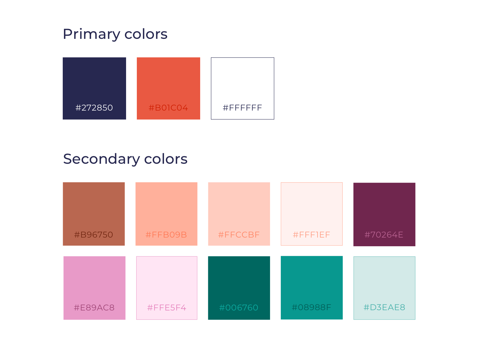
I think the must-have elements that the AWIE team and I decided that needed to be changed were not just elements, more of a feeling, a value. We wanted the new language to be more bold and elegant, like the women who make up the AWIE community and the most important value – to establish the fact that AWIE is a community and not just a nomination program. This is why I decided that the color palette must change. The transition was from “girly” or typically feminine colors to new stronger and bolder colors.
What were the biggest changes that were made?
The biggest change that was made on AWIE’s rebrand was the decision to put the women and the content we create with the women and for them – first. The decision that led the design process from the beginning through the end was to make the amazing women and everything they have to say and share with the community at the forefront. And now we can see it on the design itself, mainly on the structure of the new website that contains a lot of new and different types of content, for the community and about the community.
What were some of the challenges you faced along the way?
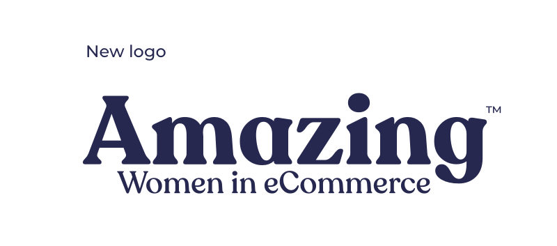
One of the main challenges I faced was whether to change AWIE’s logo or not, and how much to change it if so. After lots of research and questioning, I understood that AWIE has a very memorable and recognizable logo that people know and love, so I decided to keep the logo’s structure in order to make it look familiar and still recognizable, but to come up with a new, more updated and modern font and colors.
What are your favorite features of the new AWIE?
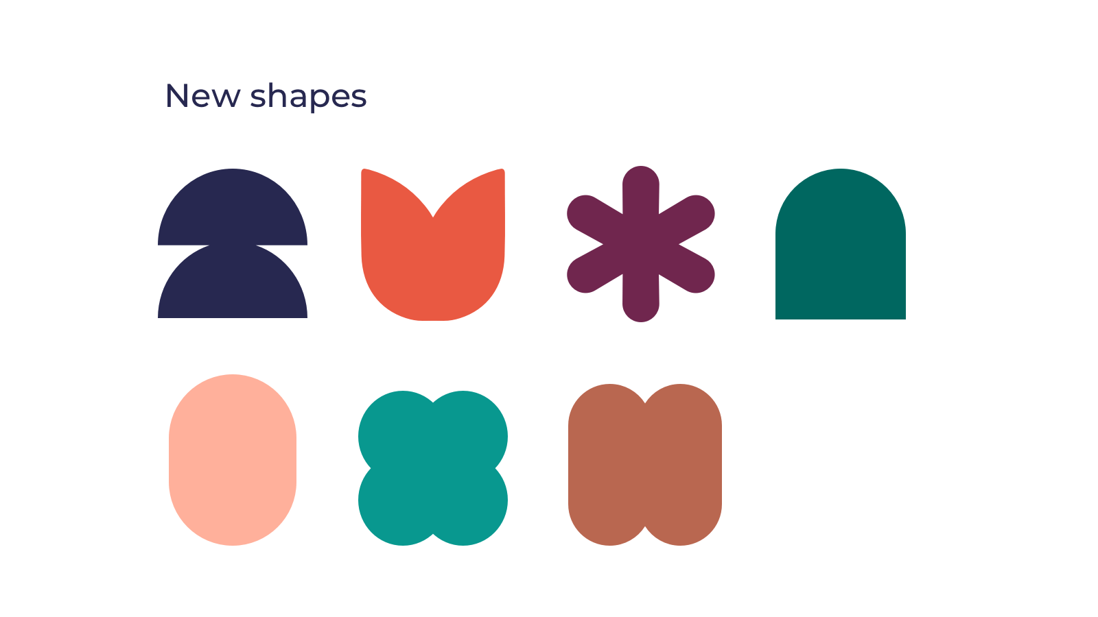
My favorite assets in the new AWIE’s language are the new shapes collection. I think they feel really modern, mature, bold, and they are really fun and easy to work with in order to create a lot of beautiful designs for AWIE. The thought behind the creation of those shapes was that each shape is a representation of a different kind of a personality – but they’re all creating together a community, like AWIE is a community that is made of many types of bold and talented women from the eCommerce industry.
You can see the new design on the AWIE website, and if you haven’t already, nominate an amazing woman to be a 2023 Honoree and join our Slack community to connect with women in eCommerce from all over the world.








 Join a free demo, personalized to fit your needs