


What is a Rage Click? Understanding User Frustration on Your Website
Ever found yourself tapping a button on a website over and over, hoping it would finally do something? That feeling of frustration, that quick, repeated tapping – that’s pretty much what we call a rage click! In the world of websites and online shopping, a rage click isn’t just a tiny annoyance; it’s a big flashing sign that something isn’t working right. For businesses, especially those selling things online, understanding rage clicks is super important. It helps them make their websites smoother, happier places for you to visit. Let’s dive into what these angry clicks mean and how they can be fixed to create a better experience for everyone.
What Exactly is a Rage Click?
Imagine you’re trying to play your favorite online game, and you tap the “Start” button, but nothing happens. What do you do? Most likely, you tap it again. Maybe even a few more times, perhaps a little faster or with more determination, hoping it will finally respond. That quick, repeated tapping on something that isn’t giving you the expected result – that’s a rage click!
On a website, a rage click happens when a user repeatedly clicks or taps on an element (like a button, an image, or even just a blank space) because they aren’t getting the reaction they expect. Perhaps the button is broken, or the page is loading very slowly, making them think their first click didn’t work. The key here is the frustration. It’s not just a casual double-click; it’s an annoyed, persistent series of clicks that signals the user is confused or upset.
Think about it: you see a tempting “Shop Now” button for a cool new item. You click it, and… nothing. The page doesn’t change, no item is added to your cart, and there’s no message explaining what’s happening. What’s your next move? Probably another click. And another. Soon, you might be clicking furiously, wondering why the website isn’t doing what it’s supposed to. This isn’t just bad for you; it’s a huge problem for the company running that website.
Why Do People Rage Click? Common Frustrations
Rage clicks don’t just pop up out of nowhere; they’re usually a symptom of a deeper issue on a website. These issues can make even the most patient person feel a little bit annoyed. Here are some of the most common reasons why people start rage clicking:
- Broken or Unresponsive Elements: This is probably the number one reason. You click a button that’s supposed to add an item to your cart, go to checkout, or send a form, and absolutely nothing happens. It’s like pressing a doorbell that’s disconnected – you might press it a few times just to be sure.
- Slow Loading Pages: In today’s fast-paced world, nobody likes to wait. If a page or a part of a page takes too long to load after a click, users might assume their click wasn’t registered and click again, and again. Their patience runs out long before the page loads.
- Confusing or Misleading Design: Sometimes, something on a website looks like it should be clickable, but it isn’t. Maybe it’s a picture with a fancy border or text that’s colored like a link. When users click these “fake” buttons or links and get no response, it’s incredibly confusing.
- Tricky Forms: Have you ever tried to fill out a form, clicked “Submit,” and then nothing happened, or an error popped up without telling you what was wrong? This can be super frustrating, leading to repeated clicks on the submit button.
- Pop-ups That Won’t Go Away: Sometimes, a pop-up appears (maybe to sign up for a newsletter), and the little ‘X’ button to close it is tiny, hidden, or doesn’t work right. Users then click all over the pop-up, desperately trying to make it disappear.
- Elements That Move Unexpectedly: This is a sneaky one! You’re just about to click a button, and suddenly, another image or advertisement loads and pushes the button out of the way. You end up clicking somewhere else entirely, and your intended action fails, prompting you to try again.
These issues show that the website isn’t easy to use. When a website is frustrating, it makes people want to leave, and that’s not good for any business that relies on online visitors.
The Hidden Signals: How Businesses Spot Rage Clicks
It’s not like customers shout “I’m rage clicking!” at their screens, so how do website owners figure out when and where this frustration is happening? Well, just like detectives, businesses use special tools to look for clues. These tools help them see how people are really using their website and point out problem areas.
Detective Tools for Website Owners
- Heatmaps: Imagine a map of your website where colors show where people click. Bright red or orange spots mean lots of clicks, while cool blue means fewer. Heatmaps can show “hot spots” where people are clicking repeatedly, even if there’s nothing interactive there, or if a button isn’t working. It’s like seeing all the places where visitors are trying to push a non-existent button or a broken one.
- Session Recordings: These tools are like secret cameras (but don’t worry, they keep your personal info private!). They record a user’s entire journey through a website, showing every scroll, every mouse movement, and every click. When website owners watch these recordings, they can see if someone clicks the same spot multiple times in a row without getting a response – a clear sign of a rage click. These recordings really help businesses see their website through the eyes of their customers.
- Analytics Software: These are smart programs that count everything. They track how many times a particular part of a webpage is clicked. If a certain image, which isn’t supposed to do anything when clicked, is getting hundreds of clicks, or if a “Next” button is clicked five times by the same user in a few seconds, the analytics software flags it as unusual behavior. This data helps piece together the puzzle of user frustration.
What These Signals Tell Businesses
These detective tools give businesses super important information. They act like a road map to where the bumps and potholes are on their website. Here’s what these signals tell them:
- Exact Problem Areas: They pinpoint the specific buttons, images, or sections of a webpage where users are getting confused or frustrated. This helps businesses know exactly what needs fixing.
- User Expectations: Sometimes, users click on something that *looks* like it should do something, even if the designer didn’t intend it to. Rage clicks here show a mismatch between what users expect and what the website actually does.
- How to Boost the Customer Experience: Ultimately, rage clicks are all about a poor customer experience. Finding and fixing these issues makes the website much easier, more enjoyable, and less stressful to use. This is super important for keeping customers happy and encouraging them to return.
By understanding these hidden signals, businesses can make smart choices about how to improve their websites, turning potentially negative experiences into positive ones, and helping people accomplish what they came to do. This leads to happier customers and a more successful online business.
Why Rage Clicks are a Big Deal for Businesses
You might think, “So what if someone clicks a button a few extra times? It’s just a click, right?” Well, for businesses, especially those that sell things online, rage clicks are far from a minor issue. They’re like little alarms going off, signaling big problems that can seriously hurt the business in many ways.
1. Losing Customers and Sales
Imagine you’re at a toy store, and you pick out the perfect toy, but when you go to pay, the cash register doesn’t work. How long would you stand there waiting? Not long! You’d probably leave and find another store. The same thing happens online. If a “Buy Now” or “Add to Cart” button isn’t working because of rage clicks, customers get annoyed and leave. This means the business loses a sale, and that customer might never come back. It’s a direct loss of money and a missed chance to keep a customer.
2. Damaging the Brand’s Reputation
When you have a frustrating experience on a website, how do you feel about that company? Probably not very good. Rage clicks create negative feelings. If customers constantly encounter problems, they’ll start to think of that brand as difficult, unreliable, or not caring about their experience. This can really hurt the brand’s good name and make people less likely to trust it or recommend it to others. Trust is a big deal for online businesses.
3. Lower Conversion Rates
In the world of online business, a “conversion” means a customer completing an important action. This could be buying a product, signing up for an email list, or filling out a form. Rage clicks are like giant roadblocks in the way of these conversions. If a customer can’t click the “checkout” button because it’s faulty, they can’t finish their purchase. This means fewer people are doing what the website wants them to do, directly affecting how successful the business is.
4. Negative Reviews and Bad Word-of-Mouth
Everyone knows that happy customers are good for business. They’re likely to tell their friends about a great product or a smooth shopping experience. But unhappy customers? They’re often even more eager to share their bad experiences! If someone has a website experience that makes them rage click, they might post about it on social media, warn their friends, or leave a really bad review. This kind of negative word-of-mouth can scare away many potential new customers before they even visit the site.
Making Loyalty Programs Less Effective
Businesses work hard to build customer loyalty, often through special loyalty programs that reward repeat customers. But you can’t build strong loyalty on a foundation of frustration. Customers need smooth, easy, and enjoyable experiences to feel good about coming back again and again to earn rewards. A customer who frequently rage clicks is not building loyalty; they are building resentment, and they’re much less likely to engage with any loyalty program offered.
So, you see, rage clicks are much more than just a little glitch. They are powerful signs that directly impact a business’s income, its reputation, and its ability to grow and keep customers happy and engaged. Ignoring them can be very costly.
Turning Frowns Upside Down: Fixing Rage Clicks
The great news is that once businesses know what rage clicks are and where they’re happening, they can absolutely do something about them! Fixing these issues is all about making the website a joy to use, not a source of frustration. Here’s how businesses can take those angry clicks and turn them into happy, productive ones:
1. Really Listen to Your Users
The best way to know what’s wrong is to ask! Businesses can get feedback directly from their customers. Tools like Yotpo Reviews are excellent for this, allowing people to easily share their experiences and point out what works well and what causes trouble. When customers share their thoughts, whether it’s about a product or the actual shopping journey, businesses get incredibly valuable clues. Learning how to ask customers for reviews in the right way can uncover hidden problems that lead to rage clicks.
2. Test Everything, Always!
Just like you’d test if your bike brakes work before a big ride, websites need constant checking. Businesses should thoroughly test every button, every link, and every form to make sure they’re working exactly as they should. This often involves having real people try out new designs before they become live on the internet, or using special automated programs to scan for broken parts. Regular testing helps catch problems before they frustrate real customers.
3. Clear and Simple Design is Super Important
When it comes to websites, keeping things simple often makes them better. Businesses should aim for a clear, easy-to-understand design where it’s immediately obvious what you can click on and what you can’t. Buttons should always look like buttons. Links should be underlined or styled in a way that makes them stand out. Avoiding messy layouts and too many things on one page can prevent a lot of confusion and reduce those frustrated clicks.
4. Speed is Everything!
Nobody likes waiting, especially online. Websites need to load super fast on all kinds of devices, whether it’s a powerful computer or a smartphone using a slower internet connection. Businesses spend a lot of time making their images smaller, streamlining their code, and improving their computer servers to make sure pages appear almost instantly. A fast website means fewer impatient clicks because people aren’t left wondering if their action went through.
5. Make Forms as Easy as Pie
Filling out forms online can sometimes feel like a chore. Businesses should design them to be as simple as possible. This means only asking for information that’s absolutely necessary, giving clear instructions, and offering helpful tips along the way. If a user makes a mistake, the website should tell them exactly what went wrong and how to fix it, instead of just showing a vague error message.
6. Give Instant Feedback
When you click a button, you expect something to happen right away. If the website needs a moment to think or process something (like an order), it should show you that it’s busy working. A little spinning wheel, a progress bar, or a message saying “Processing your order…” can reassure users and stop them from repeatedly clicking, thinking their first click failed.
How Yotpo Helps Make Customers Happy (and Avoid Rage Clicks)
Creating a website where customers don’t rage click is all about building a fantastic customer experience. Yotpo’s tools play a big role in this by helping businesses understand their customers better and create positive interactions that encourage loyalty and trust.
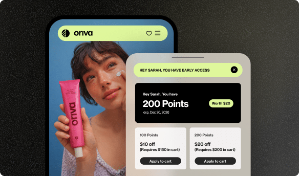
Yotpo Reviews: Your Website’s Early Warning System
Imagine having thousands of customers openly telling you exactly what they think about their shopping journey on your website. That’s exactly what Yotpo Reviews helps businesses achieve. When customers leave detailed feedback, they often mention areas where they got stuck, confused, or frustrated. For example, a review might say, “The new shirt is great, but it was really difficult to find the size chart, and the ‘Add to Cart’ button felt unresponsive!” This kind of honest, direct insight is invaluable. It helps businesses pinpoint specific glitches, confusing designs, or unclear instructions that are causing users to rage click.
- Direct Customer Feedback: Reviews provide a clear, direct line to understanding where customers face difficulties, helping businesses prioritize fixes.
- Building Trust and Transparency: When a business clearly shows they listen to customer feedback and make improvements, it builds trust. This trust can make customers more patient and less prone to rage clicking, knowing their voice is heard.
- Rich User-Generated Content (UGC): Reviews, customer photos, and videos (all forms of user-generated content) also help future shoppers. By providing comprehensive product information and social proof, UGC helps customers make informed decisions, which reduces confusion and frustration during their shopping journey.
Yotpo Loyalty: Rewarding a Smooth Customer Journey
A great loyalty program isn’t just about giving discounts; it’s about building a strong relationship with customers based on positive and rewarding experiences. Yotpo Loyalty helps businesses create programs that make customers feel appreciated and encourage them to return time and time again. When customers have a smooth and enjoyable experience on a website, they are much more likely to engage with a loyalty program, earn rewards, and become repeat, valued buyers.
- Encouraging Repeat Engagement: A well-designed loyalty program, like those built with Yotpo’s solutions, means customers are motivated to come back. If the website provides a positive experience free from rage clicks, customers will happily participate in earning points and redeeming rewards.
- Fostering Overall Satisfaction: By creating a rewarding and positive environment, businesses ensure that customers are generally happier with their interactions. This reduces the likelihood of them hitting a wall of frustration and rage clicking. The aim is to make every step of the customer’s journey, from browsing to earning loyalty points, as pleasant and effortless as possible.
There’s a powerful synergy between Yotpo Reviews and Yotpo Loyalty: a website that successfully minimizes rage clicks leads to happier customers who are more inclined to share positive reviews. These glowing reviews, in turn, attract more new customers who then enjoy a great experience themselves, making them happy to join and actively participate in a loyalty program. It’s a continuous, positive cycle of improvement, customer satisfaction, and growth for the business.
Let’s Look at Some Examples: Rage Clicks and Their Solutions
To make this even clearer, here’s a table showing some common situations where rage clicks happen, why they occur, how businesses can fix them, and how Yotpo’s tools contribute to creating a better, less frustrating online experience.
| Rage Click Scenario | Why it Happens | How to Fix It | How Yotpo Helps Create a Better Experience |
|---|---|---|---|
| Clicking a greyed-out “Add to Cart” button multiple times. | The item is out of stock or a required option (like size or color) hasn’t been chosen, but the button doesn’t clearly explain why it’s inactive. | Change the button text to “Out of Stock” or “Select Size First.” Display a clear, friendly message telling the user exactly why they can’t proceed. | When customers use Yotpo Reviews, they often describe their entire shopping journey. If they repeatedly encounter stock issues or unclear purchase paths, their feedback will highlight these frustrations. Businesses can then use this direct feedback to improve product pages and button clarity, leading to fewer rage clicks and happier shoppers ready to participate in a Yotpo Loyalty program. |
| Repeatedly tapping an image that looks like a button. | The image’s design (e.g., a shadow, bright color, prominent placement) makes it appear clickable, but it’s just a static picture with no function. | Apply clear design standards: only elements that perform an action should look like buttons or links. Avoid styling static images in ways that suggest interactivity. | Understanding user expectations for website elements can be gathered through the collective feedback on Yotpo Reviews. If customers mention confusion about navigation or what’s clickable, it signals a need for clearer design. Addressing this prevents rage clicks and creates a more positive atmosphere for building customer loyalty. |
| Clicking a submit button multiple times on a slow form. | The form takes too long to process after the first click, making the user believe their action wasn’t registered, so they keep clicking. | Provide immediate visual feedback, such as a spinning loader icon, a progress bar, or text like “Submitting your details…” Also, optimize the form’s processing speed. | A smooth and efficient form submission is a crucial part of a positive customer journey. Businesses leveraging Yotpo Loyalty know that every interaction contributes to a customer’s overall satisfaction. While Yotpo doesn’t directly speed up forms, customers who experience a fast, frustration-free site are more likely to complete sign-ups, enroll in loyalty programs, and provide positive reviews. |
| Frantically clicking to close an annoying pop-up. | The “X” button to close the pop-up is tiny, difficult to find, or unresponsive, making the user feel trapped and desperate to close it. | Ensure pop-ups have a clearly visible, easily clickable close button. Test their behavior across various devices (phones, tablets, computers) to ensure consistent usability. | Poorly designed pop-ups can severely detract from the customer experience. By optimizing the website to reduce such frustrations, businesses ensure customers have a more pleasant journey. This makes them more receptive to leaving positive feedback through Yotpo Reviews and more engaged with loyalty programs. |
| Repeatedly clicking a product image to enlarge or zoom in. | The image doesn’t respond to clicks, or the zoom feature is either hidden, difficult to activate, or simply not working as expected. | Clearly indicate if images are zoomable, for example, by adding a magnifying glass icon. Provide a dedicated “Zoom” button, and ensure the zoom function works reliably and is easy to use. | Visual user-generated content, such as customer photos and videos collected by Yotpo, often showcases products in real-life settings, helping customers visualize items without needing to excessively zoom. This rich content builds confidence and can reduce the need for potentially frustrating interactive image features, enhancing the shopping experience. |
The Takeaway: Happy Clicks Make Happy Customers
In our digital world, every click you make on a website tells a story. And a rage click? That story is loud and clear: it’s about frustration, confusion, and a customer who is probably very close to giving up and leaving. For businesses, recognizing and fixing these hidden signals of distress is not just about making a website look nice; it’s about building a strong foundation for customer satisfaction and long-term success.
By using smart tools to spot these frustrated clicks, listening carefully to what customers say (and even what their actions show), and continuously working to make websites clearer, faster, and more intuitive, businesses can turn those angry taps into confident, happy clicks. When customers have a smooth, enjoyable experience, they’re much more likely to complete their purchases, come back again and again, and even tell their friends about how great your brand is.
Ultimately, a website designed to prevent rage clicks is a website designed with people in mind. It respects their time, understands their needs, and guides them smoothly towards their goals. And that, in turn, paves the way for great reviews, strong customer relationships, and lasting customer loyalty.


 Join a free demo, personalized to fit your needs