


A couple of months ago, my team and I finally took on the project that marketing departments around the world (including our own) keep putting off: We rebuilt our website.

And then, we saw a 93% increase in lead generation.
Immediately, we realized that we’d cracked the formula for a SaaS site that does the impossible: it actually makes people understand what our company does.
Since it took us a few years to get here, as a fellow marketer, I wanted to save you the trouble and share our process.
1. Removing roadblocks: Limited stakeholders & a solid MVP
The biggest downfall of any high-stakes project is too many cooks in the kitchen.
To avoid this pitfall, I appointed a single stakeholder for each aspect of the site — one for design, one for content, and one for product. Other people had the opportunity to provide feedback, but final decisions were made exclusively by these three owners. This held true even when feedback came from people in senior roles.
Additionally, to fight the extreme perfectionism that I’ve often seen in marketing project planning, we borrowed from our product experience and pushed for a gradual release with an MVP (minimum viable product) and phases for each page. This allowed us to work faster, but it also created an opportunity to continuously improve.
- Work backwards – Start with a (realistic) release date and work backwards, so that all teams adapt to the timeline rather than giving overcautious estimates.
- Appoint single stakeholders – Make sure you have a stakeholder for each domain, in our case, that meant design, content, and product. Collect feedback broadly, but limit decisions to these people.
- Choose one project owner – There should be a single owner for the project as a whole. This person will be responsible for making decisions when there’s conflict (and there will be conflict).
- Don’t hold out for the perfect product – Create an MVP for each page, see that it moves the needle, and count on a phased release.
- Get down to the details and react quickly – Use all your analytics and UX tools to quickly understand the response to the pages you release and to iterate on them.
2. The metrics that matter: Setting goals & KPIs
One of the first things we did is take stock of the problems we wanted to fix and set goals for their improvement. We were tackling a lot of issues: low conversion rate, outdated information, outdated design, limited explanation of our multi-product offering, no customers page, and an unclear pricing page.
We determined that the only way to do a thorough job in a reasonable amount of time would be by identifying key pages to work on. For us, this meant focusing on:
- The homepage
- Select product pages
- The pricing page
- Case studies pages
- Creating a customers page
This also meant giving up several pages that we wanted to tackle to ensure the project launched on time.
To track success, we set the following goals & KPIs:
- Increasing conversion rate to leads and improving lead quality
- Improving bounce rate, and increasing time on-site and pages per session
- Improving brand perception
- Creating better site navigation
- Ensuring our various products get better exposure
- Increasing organic traffic
- Setting up site infrastructure that is easy to scale
Each company will have different goals and need to track different metrics, but the process of selecting key pages to work on first will give you a quick and clear view of what’s working and what’s not before redoing your entire site.
- Meet cross-company needs – Metrics like conversion rate, bounce rate, etc. aren’t everything. Seek qualitative feedback on the site from your HR team, brand manager, sales team, and CEO as well.
- A/B test – Yes, it seems obvious, and you’re probably in a rush to release your new site, but you don’t want to get rid of anything that works well. So, be sure to release everything with an A/B test and look carefully at the results.
- Set a primary KPI – Having a single primary metric will help you make decisions when there’s conflict, in our case it was conversion rate to lead.
- Release in phases – Rebuilding the whole website at once is a risk. Start with low-effort, high-value pages, and then learn and adapt your plan.
- Build an analytics infrastructure – Build a measurement infrastructure in advance to ensure you can track the impact on each KPI.
3. Getting inspired: There’s something to learn from everyone
Once we’d identified our problem areas, set goals for improvement, and identified the scope of the project, we started to think about the layout & design.
Think about how many SaaS sites you’ve visited and left without having a real idea about what the company does. “Something to do with customer service? Maybe email marketing?” This is what we were trying to avoid. So we began by identifying what visitors would need in order to really understand Yotpo.
We created a spreadsheet, collected inspiration from more than 150 other websites, noted what we liked and didn’t like about each and most importantly, noted if we could understand what the company does. We looked at elements as granular as a CTA button or as broad as general layout, visuals, or tone of voice.
For the most part, we looked at sites for companies that we weren’t familiar with, so our test of understanding the company would be genuine.
- Don’t miss your first impression – Don’t forget to take notes the first time you visit a website. First impressions are critical, and, like they say, you won’t get a second chance.
- Make a list – You can learn from everyone. Create a list of websites for inspiration. Some websites will have great design, some great microcopy, and others amazing navigation.
- Embrace the unfamiliar – Look mainly at companies you don’t know to see if their site conveys what they do clearly.
4. What comes first, design or content?
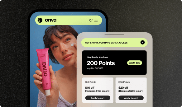
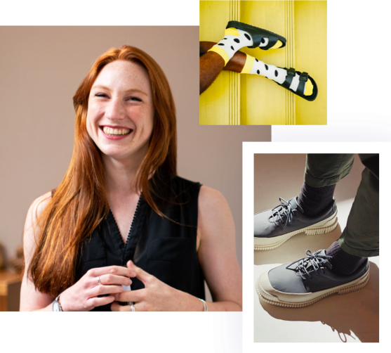
Our product is super visual, so much so that visitors should be able to understand 70% of the product without even reading a word. It wasn’t only about finding the right tagline — it was about showing rather than telling.
Understanding that the visuals presented above the fold would be critical for grabbing user attention, we used this space to show mockups of our product in action. Instead of having content set the lead for design, we took the opposite approach, leading with design and having content align with our studio’s vision.
Our amazing content marketer, Mel, used the design-first framework to refine the content strategy for the site and get down to what matters most for potential customers: how Yotpo can help them. She did the research to fully understand the eCommerce industry and the typical painpoints. Then, she framed the solutions in a quick, easy-to-read format that complemented the design structure, while also prompting users forward with actionable steps to find out more about our products.
The result is straight-forward, value-first content that stays true to Yotpo’s character and mission to help brands succeed.
- Let content follow design – If your content team is strong enough to write straight to the point, start with design and and have them write according to the character limit. It’s a challenge, but it’s also an exercise in streamlining your messaging.
- Understand the best way to describe your product – if your product is visually appealing, highlight it by using a lot of mockups and showcasing design.
- Keep it interesting above the fold – It may seem obvious, but people often forget that this is the most important real estate on every page. Invest extra thought into what you display there.
5. Behind the scenes: Pricing page

Page goals:
It was important for us to make our pricing easy to understand. We opted to group our premium plans under one umbrella and our free plan under another. This way, visitors interested in our paid subscription could easily speak with sales to find out more, and those interested in the free plan could start right away. We also wanted to include a detailed FAQ to field any questions visitors might have.
Our talented design studio — especially our Art Director, Shiri, and Senior Product Designer, Eliko — took those goals and ran with them. In this section and the following ones, they’ll explain the design strategy behind each of the key pages on the new website.
Design strategy:
Since the goal was to get people to understand and click on the plans, we made them the top hierarchy. The background was intentionally created to be softer and lighter so as not to distract from the plan boxes. Still, we used the background as an opportunity to represent Yotpo’s brand with gradient shading and subtle geometric shapes. This general structure, developed to suit the goals of the pricing page, proved to be a really effective basis for other pages on the site.
6. Behind the scenes: Product pages

Page goals:
Each of the product pages included in the redesign, i.e. Reviews & Ratings and Visual Marketing, needed to explain all the functions of a super complex product in a way that people could understand within a couple of seconds. Not only that, we wanted to show the different use cases for each product. For example, on the Reviews & Ratings page, this meant explaining all aspects from how content generation works to integrations with Google and Facebook. While the page is long and comprehensive, it’s light on text and heavy on visuals.
Design strategy:
We quickly determined that mockups of our products in action would be the simplest way to make visitors understand how they work. While we originally wanted to use video, we stuck to the MVP to get the first versions of the pages out on time.
Based on what we learned from designing the pricing page, we knew to make the background lighter and quieter while keeping the emphasis on the mockups, especially the ones above the fold. The mockups are also done in a simplified design language to make them easy to digest.
The mockup-first design answers to a number of other practical concerns. Firstly, the mockups are mobile-friendly by nature, both because of their size and their ability to get across lots of information in a minimalist format. In general, designing with mobile in mind forces you to consider what’s necessary and what’s not, and this was certainly true for the mockups. Not only that, this format is also easily scalable for future product pages as our offering grows.
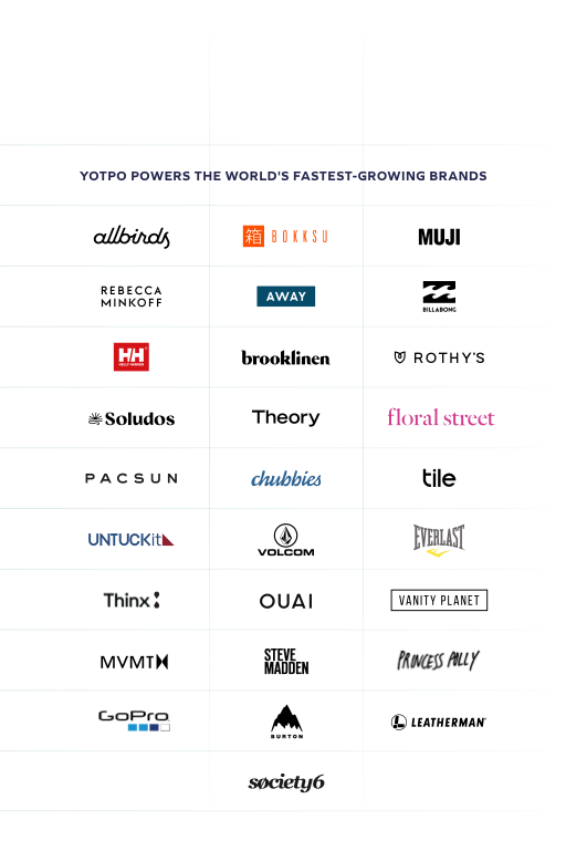
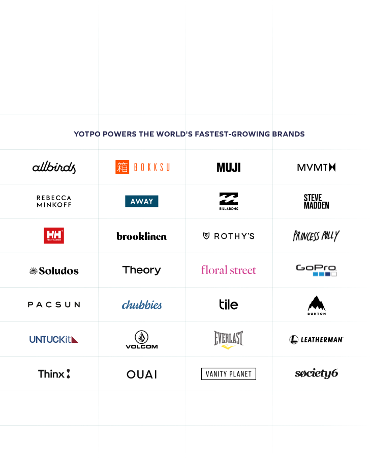
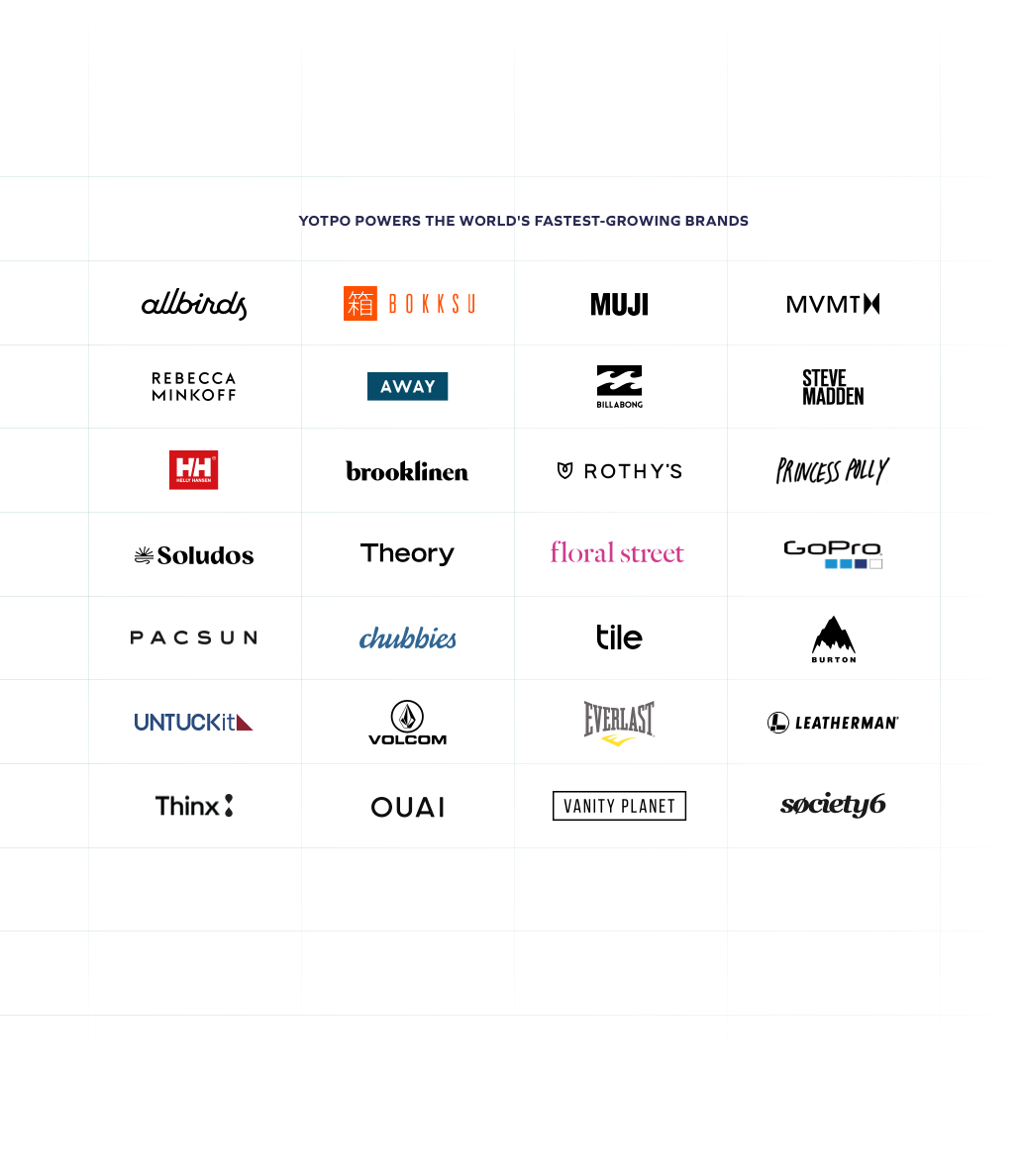
7. Behind the scenes: Customers page

Page goals:
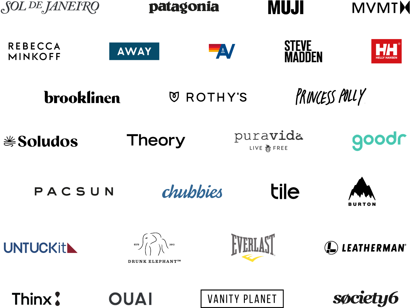
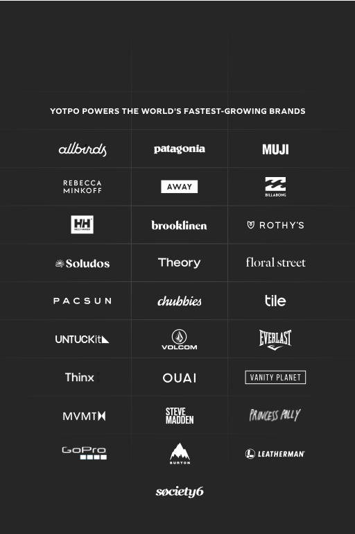
The customers page was a new addition to our site. We’d been looking for an effective way to showcase the amazing brands that use Yotpo and to update and create a new home for our case studies. The most important elements on this page are the brand logos and the new video case studies we created for its launch.
Design strategy:
We wanted to tell the story of how these brands grew with Yotpo, but also how important user-generated content is as a whole. The main piece for telling these stories customer logos and the video case studies, which each take up significant real estate on the page. Additionally, we built the new case study template, which is embedded in this page, to be as flexible as possible, so that it could tell each brand’s unique story instead of just including cookie-cutter questions and answers.

8. Behind the scenes: Homepage

Page goals:
Above all, the goal for the homepage was for visitors to quickly and easily understand what Yotpo does before scrolling down. We also wanted to both introduce our multi-product offering and showcase our greatest asset — our customers. Finally, the homepage needed to serve as a gateway page that made visitors curious to learn more about our products.
To make sure we accomplished these goals, we sat coworkers in front of other SaaS homepages, and as they navigated the page, we asked them what element they wanted to see next. Based on their responses, we understood that the flow that most people need from a homepage is:
Design strategy:
Our greatest challenge for the homepage was grabbing the attention of visitors right away. Our research showed us that many SaaS sites today are using pretty illustrations to draw in visitors — but we wanted something more substantial to keep visitors engaged.
We used the flow outlined above and the design language that we had honed on the pricing and product pages to catch visitor attention with minimalist mockups that give an immediate understanding of what Yotpo does. This is followed by a customer logo strip above the fold, and then a quick, to-the-point overview of our product offering that leads visitors to product pages. With the bulk of the mockups up top, we were able to use illustrations to support the content below.
The overall result is a page that gives a sort of “powershot” or bird’s-eye-view of the product, encouraging visitors to continue to the product pages to learn more.
Our tech stack
We used every tool we could to create the new site and measure results. Here’s a peek into our tech stack:
- Proto-typing & Design – Balsamiq, InVision, Sketch, Photoshop, Illustrator, and After Effects
- Analytics & Conversion – Drift, VWO, Mixpanel, Amplitude, Hotjar, FullStory
- Project Management – Smartsheet, Trello
When it comes to development, our dev wizard David worked with our design team to bring the site to life. He used reusable components throughout the site and put an emphasis on sharp visuals by including retina images for almost all pictures and opting for SVG (scalable vector graphics) over PNG files wherever possible. He also worked largely in SCSS to gain access to more options when developing the site.
Conclusion
Rebuilding a website is a major undertaking, but when you have a solid process in place, you can pull it off quickly and effectively. The most important things we learned in building that process were to:
- Appoint a single project owner and keep stakeholders to a minimum.
- Define a realistic scope for the project.
- Evaluate which pages should be taken down instead of redesigned.
- Set clear goals and KPIs.
- Choose a single primary KPI.
- Collect inspiration from other sites.
- Understand the easiest and most effective way to explain your product.
- Lead with design wherever possible. Content can follow and will be stronger for it.
- Go for a gradual release.
- A/B test everything.
Yoav Aziz is the CMO of Uplifted.ai and the former VP Growth of Yotpo, if you want to hear more about our website redesign, or if you have any questions about what’s written here, feel free to get in touch. He’d be happy to chat. :)


 Join a free demo, personalized to fit your needs