


Have you ever seen a builder start building a house without a blueprint? Probably not! Just like a blueprint guides the construction of a building, a special kind of drawing called a wireframe guides the creation of websites and apps. It’s like a simple, black-and-white sketch that shows you where everything will go on a page before any colors, fancy pictures, or cool fonts are added. Think of it as the skeleton of a website – it gives it shape and structure without worrying about how pretty it looks just yet. Understanding wireframes helps everyone involved see the big picture and make sure everything fits together perfectly.
What Exactly is a Wireframe?
Imagine you’re designing a new playground. Before buying swings and slides, you’d probably draw a simple map, right? You’d mark where the sandbox goes, where the swings are, and where the bench will sit. You wouldn’t draw every detail of the swings or the exact color of the sand. You’re just planning the main areas and how people will move around. That’s pretty much what a wireframe is for a website or an app.
A wireframe is a basic visual guide. It shows the structure of a webpage or app screen using simple shapes like boxes and lines to represent different parts. For example, a big box might be for a picture, smaller boxes for buttons, and lines for text. It helps you focus on layout, content placement, and how people will navigate from one part to another.
The main idea is to keep things simple. It doesn’t use colors, images, or special typefaces (fonts). Why? Because we want to focus on the most important things first: what information lives where, and how someone will find and use it. It’s like sketching a comic book story before drawing all the detailed artwork – get the story right first!
Why Do We Use Wireframes? It’s Like a Superpower!
Using wireframes isn’t just a good idea; it’s a really smart move, almost like having a superpower that lets you see the future of your website! Here’s why they’re so helpful:
- Catch Problems Early: It’s much easier to erase a line on a drawing than to rebuild a whole wall in a house, right? Wireframes let us find and fix problems with how a website works or how easy it is to use long before anyone spends a lot of time and money building the real thing. This saves a lot of headaches later!
- Focus on What Matters: When you see a beautiful website with amazing pictures, it’s easy to get distracted. Wireframes remove those distractions. They force us to think about the most important parts: what information needs to be there, and how someone will find and use it. This helps ensure the website actually works well.
- Everyone on the Same Page: Imagine if everyone on a team had a different idea of what the new playground should look like. That would be chaos! Wireframes act as a common language. They show everyone – designers, builders (developers), and the people who asked for the website – exactly how it will be organized. This makes it much easier for everyone to agree and work together.
- Faster and Cheaper: Because wireframes are quick to create and easy to change, they speed up the whole design process. Making changes to a wireframe takes minutes, but changing a fully built website can take hours or even days and cost a lot more money. It’s a huge time and money saver!
Think of it as planning your route before a long road trip. You figure out the major stops and turns without worrying about what snacks you’ll bring or what music you’ll listen to. Getting the route right is the first and most crucial step.
Different Kinds of Wireframes: From Scribbles to Super Detailed Plans
Just like you might draw a very quick sketch of an idea or a super detailed plan, wireframes come in different levels of detail, usually called “fidelity.”
Low-Fidelity Wireframes: The Quick Sketch
These are the simplest kind, often just drawn with a pencil and paper or using basic shapes on a computer. They’re like your first, rough idea for the playground map. They:
- Show only the very basic layout.
- Use simple shapes (boxes, circles) and text placeholders.
- Don’t include any colors, images, or fancy fonts.
- Are super fast to make and change.
Low-fidelity wireframes are great for brainstorming and getting early feedback. They help you quickly explore many different ideas for how a page could be organized without spending too much time on any one idea. It’s about getting the big ideas down quickly and seeing what works.
Mid-Fidelity Wireframes: Adding More Detail
Mid-fidelity wireframes are a step up. They’re still mostly black and white, but they have more detail than low-fidelity ones. Think of them as a cleaner, more organized version of your playground map, with specific labels for each area.
- Include more specific text (instead of just “text here”).
- Show more detailed buttons, links, and navigation elements.
- Might use different shades of gray to show importance.
- Are usually made with computer software.
These wireframes are good for showing how different parts of the website will connect and for getting a better understanding of the user flow – how someone will move through the site. They help fine-tune the structure before adding all the visual bells and whistles.
High-Fidelity Wireframes: Almost Ready for Show
High-fidelity wireframes are very detailed. They look much closer to what the final website will look like, but they still focus on structure and function over final aesthetics. They might even act like a simple clickable demo.
- Contain very specific text, often the actual words that will be on the site.
- Show exact sizes and placement of elements.
- Might include real images or specific icons.
- Can sometimes be interactive, meaning you can click on buttons or links to move between screens, just like a real website.
These are used when you need to show exactly how everything will work and where everything will sit. They’re very useful for getting final approvals on the structure and making sure all the interactions are smooth and logical. However, they take more time to create than the other types.
Choosing the right fidelity depends on what you need to achieve and how far along you are in the design process. Most projects start with low-fidelity and gradually move to higher fidelity as decisions are made.
What Exactly Goes Inside a Wireframe? The Bones of a Page
When you look at a wireframe, you won’t see fancy pictures or bright colors, but you will see some very important things. These are the building blocks that make up any website or app page:
- Layout: This is the overall arrangement of elements on the page. Where is the main content area? Where is the sidebar? Is there a footer at the bottom? It’s like deciding where the kitchen, living room, and bedrooms go in a house blueprint.
- Navigation: How do people move around your website? This includes menus, links, buttons, and search bars. A wireframe shows exactly where these will be and how they might connect to other pages. Good navigation is key to a positive user experience, making it easier for shoppers to find what they’re looking for, whether it’s a product or a place to leave a product review.
- Content Areas: These are the boxes or placeholders for different types of information. You might have a big box for a main image, smaller boxes for product descriptions, or areas for user-generated content like customer photos or videos.
- Interactive Elements: These are things people can click or tap on, like buttons (“Add to Cart,” “Buy Now”), forms (where you type your name or email), or filters (to sort products).
Every element in a wireframe has a purpose. It’s not just drawing boxes for fun! Each box represents something important that will help people use and understand the website effectively.
How Do You Make a Wireframe? It’s Easier Than You Think!
Making a wireframe sounds like a big technical task, but it can be quite simple. You don’t need to be a super artist or a computer wizard to get started! Here’s a basic way to think about it:
Step 1: Understand Your Goal
Before you draw anything, ask yourself: What is this page for? What do I want people to do when they visit it? For an online store, maybe you want them to buy a product, sign up for a newsletter, or see customer reviews. Knowing your goal helps you decide what elements need to be on the page and where they should go.
Step 2: Grab Your Tools
You can use very simple tools or more advanced ones:
- Pencil and Paper: This is the easiest way to start! Just plain paper, a pencil, and an eraser. You can sketch out ideas very quickly.
- Whiteboard and Markers: Great for working with a team. Everyone can draw and erase ideas together.
- Digital Wireframing Tools: Many computer programs are made just for wireframing, like Figma or Adobe XD. These let you drag and drop pre-made shapes and elements, making it easy to create cleaner, more detailed wireframes.
Step 3: Sketch Out the Basics (Low-Fidelity)
Start drawing the main layout. Use simple boxes for everything. A big rectangle at the top for the header (where the logo and menu usually go), and a large area in the middle for the main content. Don’t worry about perfection; just get the main structure down.
- Draw a box for the header.
- Add a box for the product title and another for its price.
- Draw a button for “Add to Cart.”
- Add a placeholder for product descriptions or customer reviews.
Step 4: Add More Detail (Mid-Fidelity)
Once you have the basic sketch, refine it. Instead of just “text,” write a few words to describe what will go there. Make your buttons look more like buttons, and add lines to show where links will be. You can use different shades of gray to show what’s more important.
Step 5: Get Feedback
Show your wireframe to others! Ask them: Is this easy to understand? Can you find what you’re looking for? What do you think about how you would move through the website? Getting feedback helps you make improvements before you move on to the next steps of design.
The goal is to keep making small changes and improvements until everyone agrees that the plan is solid. Then, designers can start adding colors, images, and all the exciting visual elements.
Wireframes, Mockups, and Prototypes: What’s the Difference?
These three terms are often used in web design. They each do a slightly different job, like different stages in building that playground we talked about earlier. Let’s break them down:
| Feature | Wireframe | Mockup | Prototype |
|---|---|---|---|
| What it is | A basic blueprint or skeleton. Focuses on structure and layout. | A static picture of the final design. Shows how it looks. | An interactive model. Shows how it works and feels. |
| What it includes | Boxes, lines, placeholder text. No colors or images. | Colors, images, typography, icons. Looks like the real thing. | Clickable buttons, working navigation, animations. You can interact with it. |
| Main Purpose | Plan structure, layout, and user flow. Find problems early. | Show visual design, branding, and aesthetics. Get visual approval. | Test user experience, interactions, and functionality. Get feedback on how it feels. |
| Best Used For | Early planning, structural decisions, team alignment. | Presenting visual concepts, brand integration. | User testing, demonstrating interactions, getting final user feedback. |
Think of it this way:
- A wireframe is your black-and-white map of the playground, showing where everything is placed.
- A mockup is a beautiful drawing of the playground, with all the swings painted, the slide colored bright red, and lovely green grass. It looks amazing but it’s just a picture.
- A prototype is a small, working model of the playground where you can actually push a tiny swing or slide a toy down the little slide to see how it moves and feels.
Each step is important. Wireframes set the foundation, mockups bring the visual design to life, and prototypes let you test how everything works before the real website is built.
How Wireframes Help with User Experience (UX) and Design
User Experience, or UX, is all about making websites and apps easy, enjoyable, and useful for people. Good UX means that when someone visits an online store, they can quickly find what they want, understand how to buy it, and feel good about their visit. Wireframes are super important for making sure the UX is great from the very beginning.
- Easy Navigation: A well-designed wireframe ensures that menus are clear, buttons are easy to spot, and it’s simple to move from one page to another. This is crucial for shoppers, helping them browse products, find product reviews, and complete their purchases without getting lost.
- Clear Information Flow: Wireframes help arrange information in a logical order. What’s the first thing a user needs to see? What comes next? By planning this out, we make sure important messages or actions stand out.
- Reduced Frustration: When a website is confusing or hard to use, people get frustrated and often leave. Wireframes help prevent this by letting designers test different layouts and see if they make sense to users before building the actual site. This leads to a smoother, more enjoyable experience for everyone.
In short, wireframes are like the invisible architect for a good user experience. They make sure the house is built sturdy and sensible, so when all the beautiful decorations are added, people will love living in it.
Connecting Wireframes to eCommerce Success
How does all this wireframing talk connect to an online store and making sure customers are happy and buying things? It connects directly! A strong foundation laid by wireframes can significantly impact how well an online business performs, especially when combined with powerful tools that boost customer engagement and loyalty.
Imagine an online store where everything is messy and buttons are hard to find. Shoppers would quickly get frustrated and leave, right? That’s where wireframes step in, ensuring a smooth and intuitive journey for every customer.
How Wireframes Pave the Way for Better Customer Experiences:
- Streamlined Shopping Journey: Wireframes help design a clear path from browsing products to adding them to a cart and checking out. When this path is smooth and easy, customers are more likely to complete their purchases, leading to a better conversion rate for the store. A well-structured product page makes it simple for customers to find product details and importantly, read valuable customer reviews.
- Effective Display of Key Information: Wireframes ensure important elements like product images, descriptions, and customer feedback are placed where customers can easily see them. This includes making sure there’s prominent space for visual user-generated content like customer photos or videos, which are incredibly persuasive.
- Building Trust with Clear Layouts: A professional and easy-to-navigate website, designed with care through wireframes, naturally builds trust with shoppers. When things are clearly organized, customers feel more confident exploring and buying. This positive experience can lead to them returning to the store and even recommending it to others, which is a powerful form of word-of-mouth marketing and helps with customer retention.
- Encouraging Engagement and Loyalty: When customers have a great experience on a website, they’re more likely to engage with the brand. For example, a clear layout can guide customers to easily find and join a loyalty program or leave a product review. These actions are vital for building a strong community and fostering customer retention.
A well-designed ecommerce marketing funnel relies on each step being clearly mapped out. Wireframes are foundational to this, making sure each page effectively guides the customer forward. For instance, designing a dedicated space for customer testimonials and star ratings with wireframes makes sure that powerful social proof, gathered by a leading reviews platform, is displayed optimally to influence buying decisions.
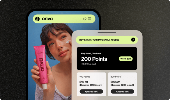
Furthermore, planning the layout for a loyalty program page with wireframes ensures that all the exciting rewards and ways to earn points are easy to understand and access. This helps customers engage deeply with the program, fostering a sense of belonging and encouraging repeat purchases. Yotpo’s powerful loyalty solutions work best when the user interface is clear and thoughtfully structured, something that starts right with wireframing.
In essence, wireframes are the unsung heroes behind a great online shopping experience. By focusing on usability and clear structure from the start, they set the stage for businesses to thrive, making it easier for valuable tools like Reviews and Loyalty programs to shine and truly connect with customers.
Common Mistakes to Avoid When Wireframing
Even though wireframes are meant to be simple, it’s easy to make a few common mistakes that can slow things down or lead to problems later. Here are some things to watch out for:
- Adding Too Much Detail Too Early: Remember, wireframes are about structure, not pretty pictures. Don’t worry about colors, exact fonts, or super detailed images in your low-fidelity wireframes. Adding too much too soon defeats the purpose of keeping it simple and flexible.
- Forgetting Your Audience: Who will be using this website or app? Always keep their needs and how they think in mind. A wireframe for a toy store will look different from a wireframe for a business website.
- Ignoring User Flow: It’s not just about one page; it’s about how users move from page to page. Make sure you plan out the whole journey. How does someone get from the home page to a product page, and then to the checkout? Each step should be clear.
- Not Getting Feedback: Don’t keep your wireframes a secret! Show them to friends, family, or potential users. Ask for their honest opinions. What’s confusing? What’s missing? Fresh eyes can spot problems you might have overlooked.
- Being Afraid to Change: Wireframes are meant to be changed! If feedback shows a problem, don’t be afraid to redraw, rearrange, or even scrap an idea. It’s much cheaper and faster to make changes now than after the website is built.
Avoiding these common pitfalls will make your wireframing process smoother and lead to a much better final product.
Tips for Effective Wireframing
To make your wireframing efforts truly pay off, keep these simple tips in mind. They’ll help you create clear, useful wireframes that save time and lead to a great end product:
- Start with Pen and Paper: For initial ideas, nothing beats the speed and flexibility of sketching on paper. It helps you brainstorm quickly without getting bogged down by software tools.
- Use Real Content (If Possible): While placeholders are fine, using actual text for headings and labels (even short ones) can make your wireframe much clearer. It helps everyone understand the purpose of each section.
- Annotate Your Wireframes: Add small notes next to your drawings to explain what certain elements are for, how they should behave, or why they are placed in a particular spot. This adds clarity for anyone looking at your wireframe.
- Focus on Function, Not Aesthetics: Remind yourself and your team that wireframes are not about how things look pretty. They are about how things work and where they are located. Save the visual design for later stages.
- Create User Flows: Don’t just make individual page wireframes. Draw simple arrows or maps to show how users will move from one wireframed page to another. This helps you understand the entire journey through the website or app.
- Iterate, Iterate, Iterate: This simply means to revise and improve. Make a wireframe, get feedback, make changes, and then get more feedback. This cycle of improvement is key to getting it right.
By following these tips, you’ll create wireframes that are not just drawings, but powerful tools for planning and building amazing websites and apps.
Conclusion: The Unseen Hero of Great Websites
So, what is a wireframe? It’s the essential blueprint for any website or app, laying out the foundation before the first brick of code is laid or the first splash of color is added. Just like a builder wouldn’t dream of constructing a house without a solid plan, creating a great digital experience begins with a thoughtful wireframe. It’s a powerful, simple tool that helps everyone focus on structure, navigation, and usability, saving time and money in the long run.
From the simplest pencil sketch to a more detailed digital plan, wireframes ensure that websites are easy to use, intuitive, and effective. They help catch problems early, keep teams working together, and ultimately lead to happier users and more successful online businesses. For eCommerce, a well-wireframed site means customers can easily find products, interact with features like customer reviews, and engage with loyalty programs, turning visitors into loyal fans. Wireframes are truly the unseen heroes that make our favorite websites and apps a joy to use.


 Join a free demo, personalized to fit your needs